QUARK EXPEDITIONS
RE - BRAND | ENVIRONMENTAL DESIGN | WAY - FINDING
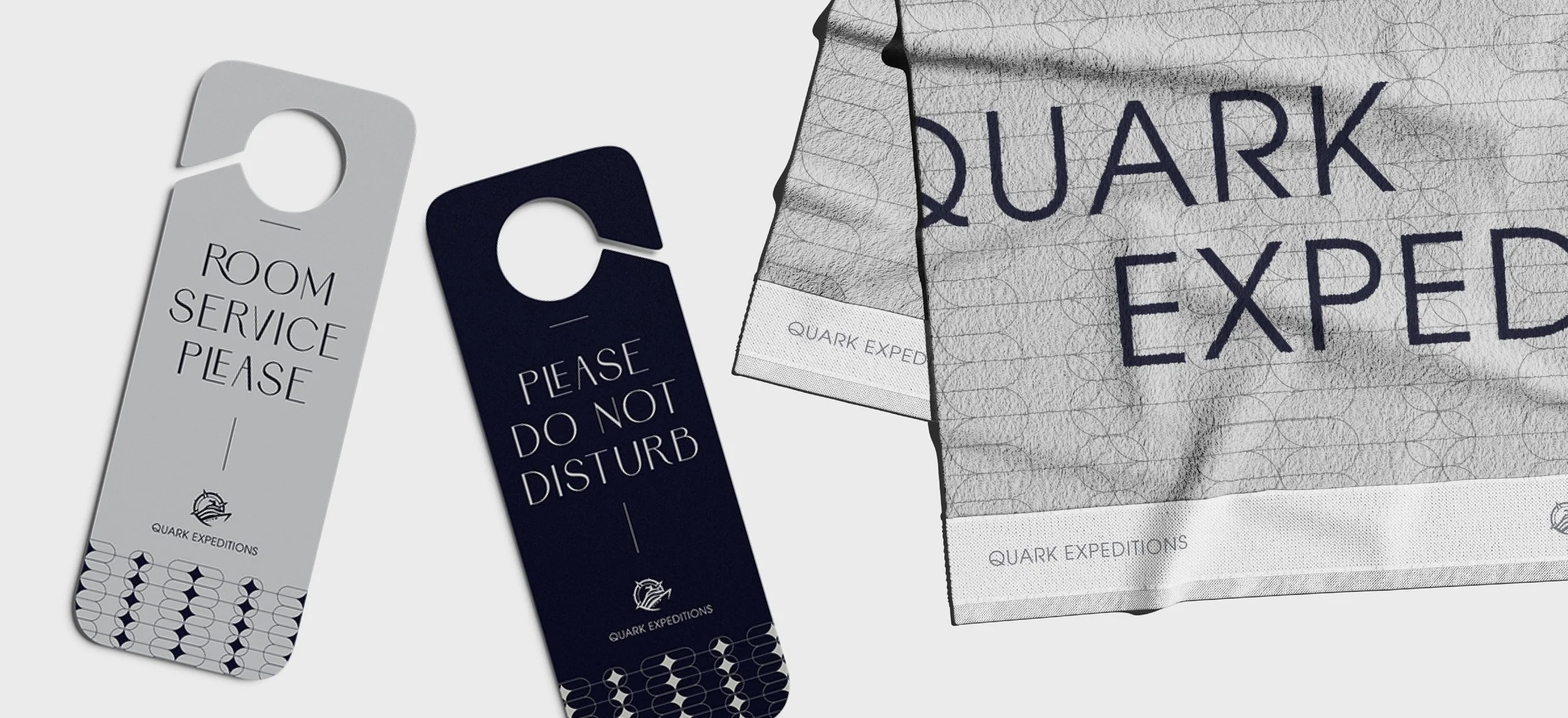
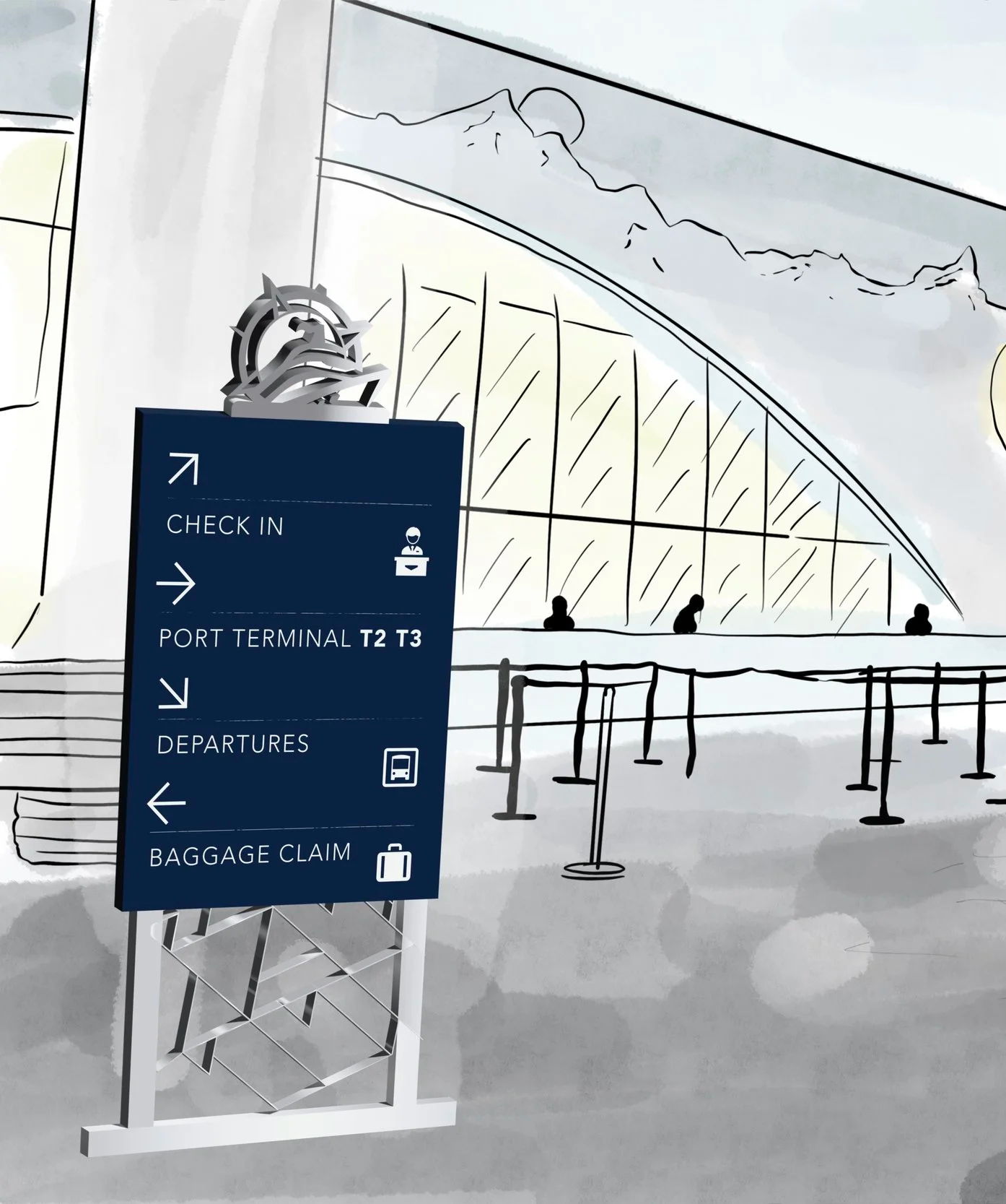
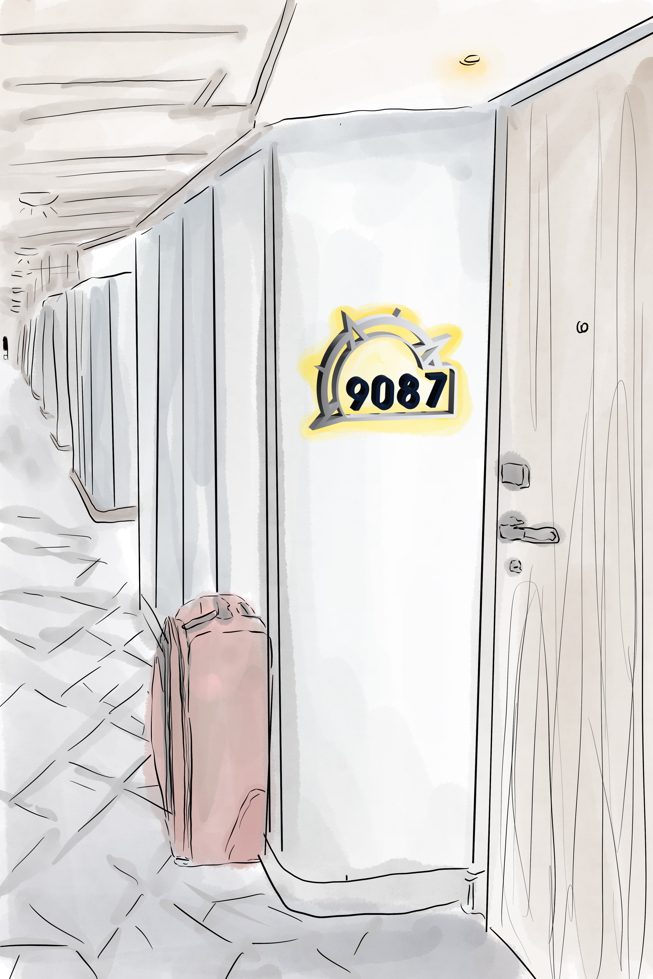
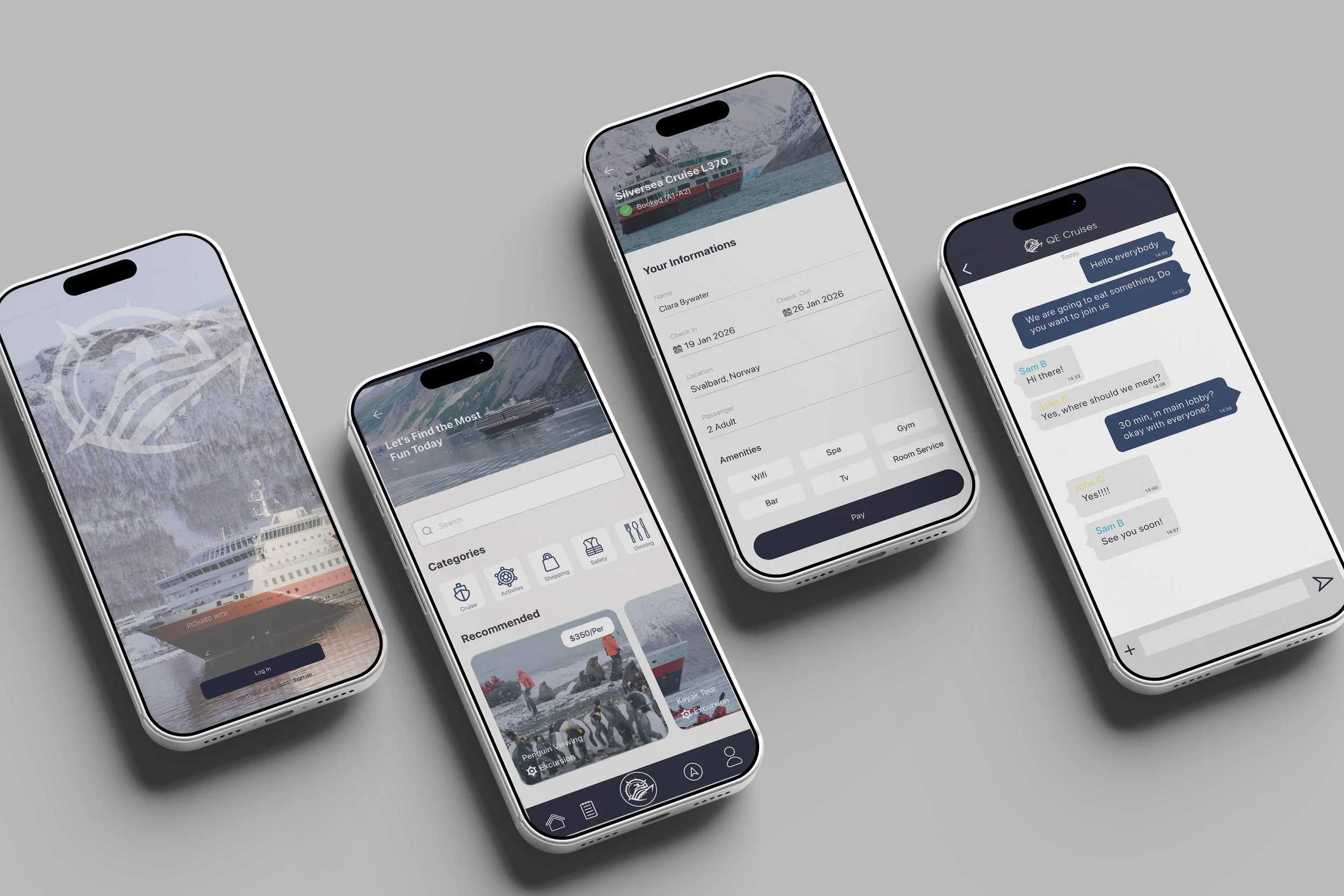
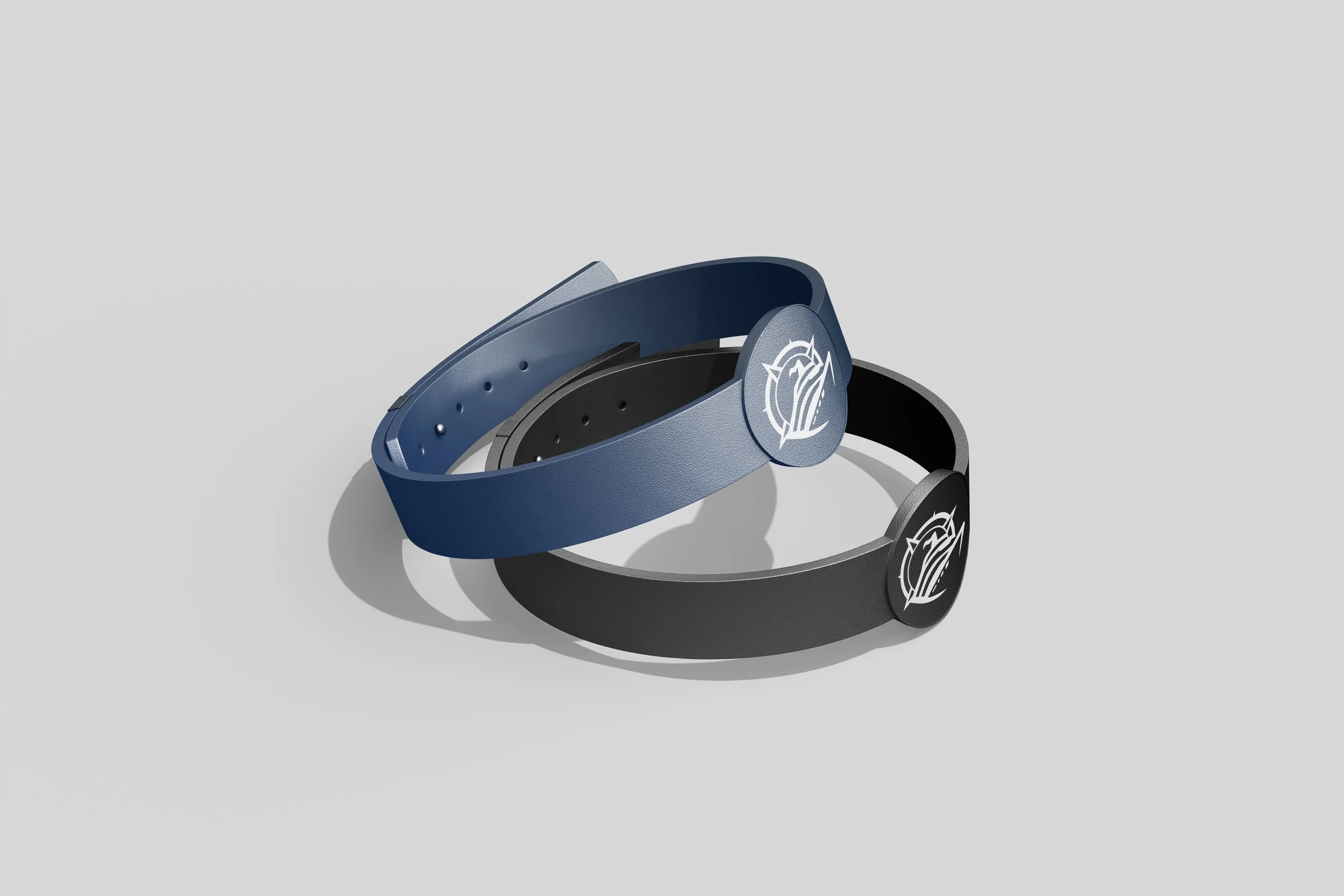
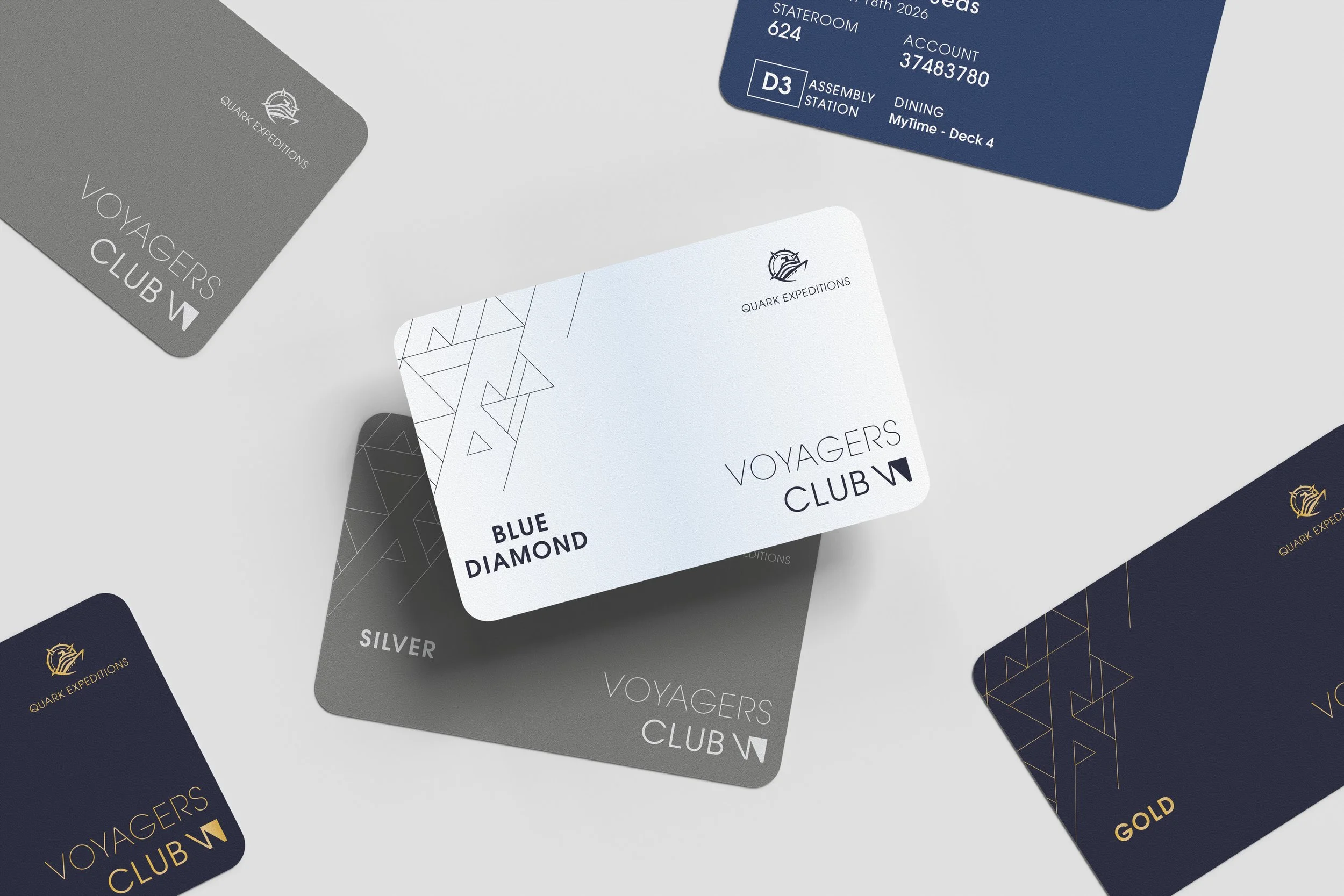
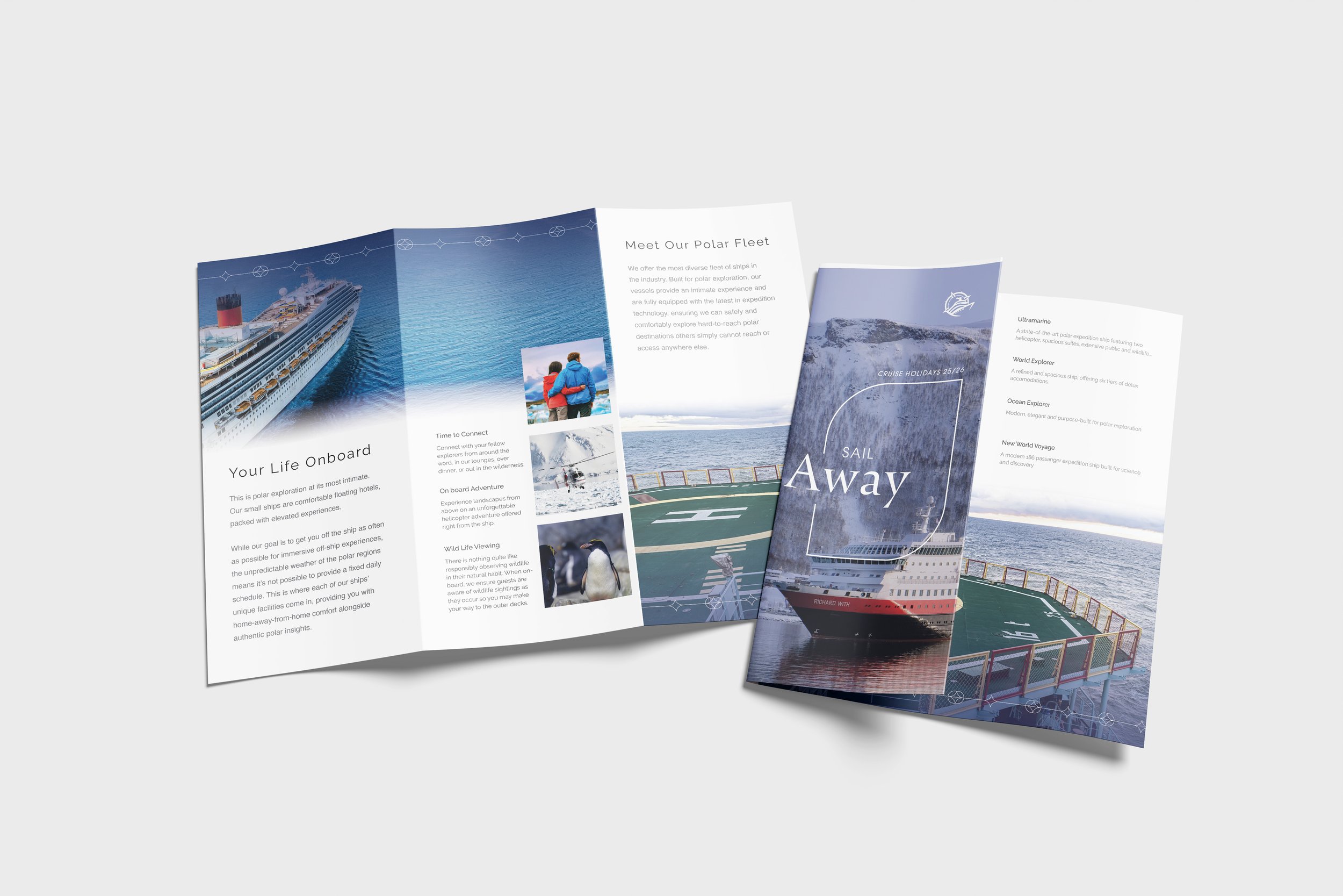
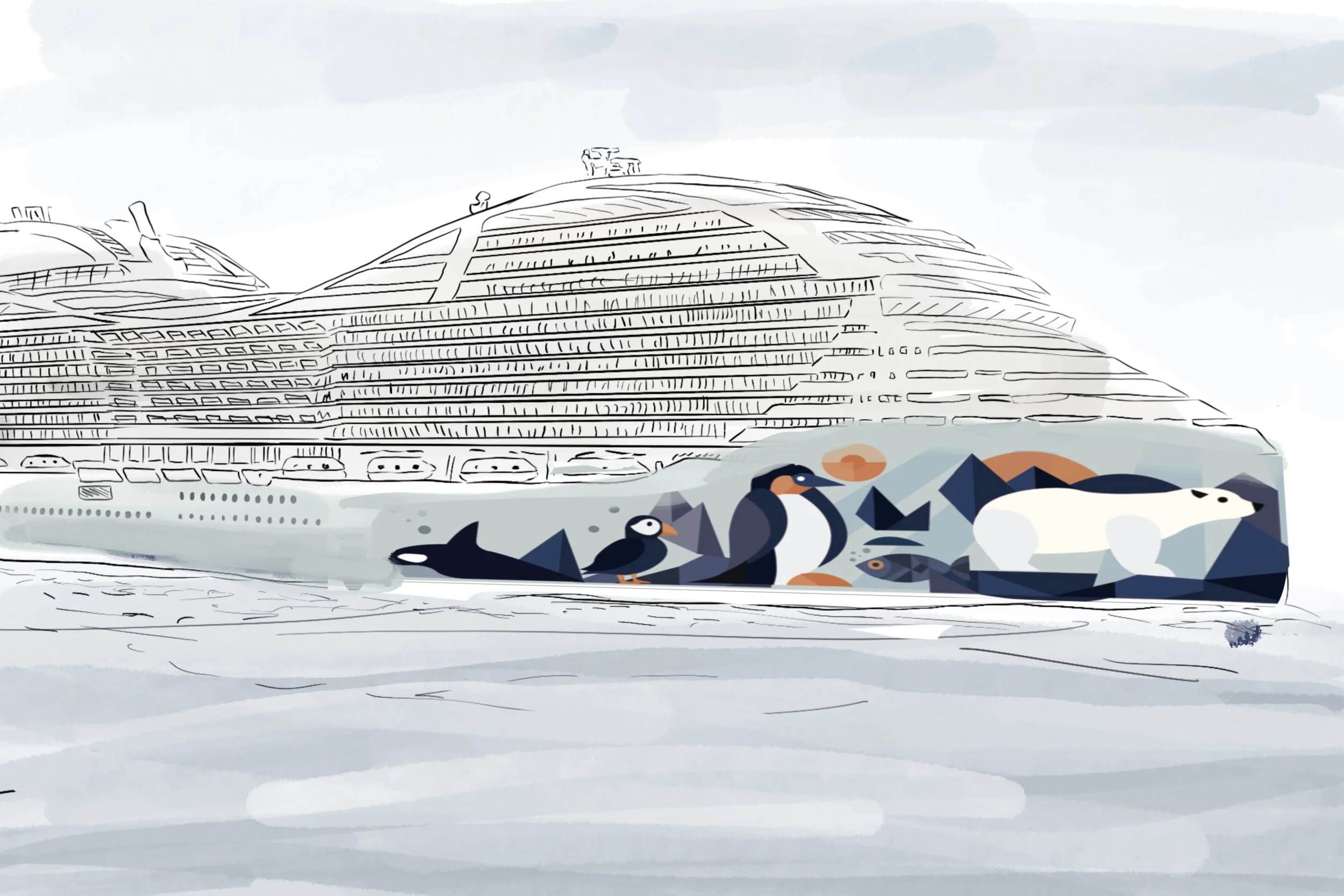
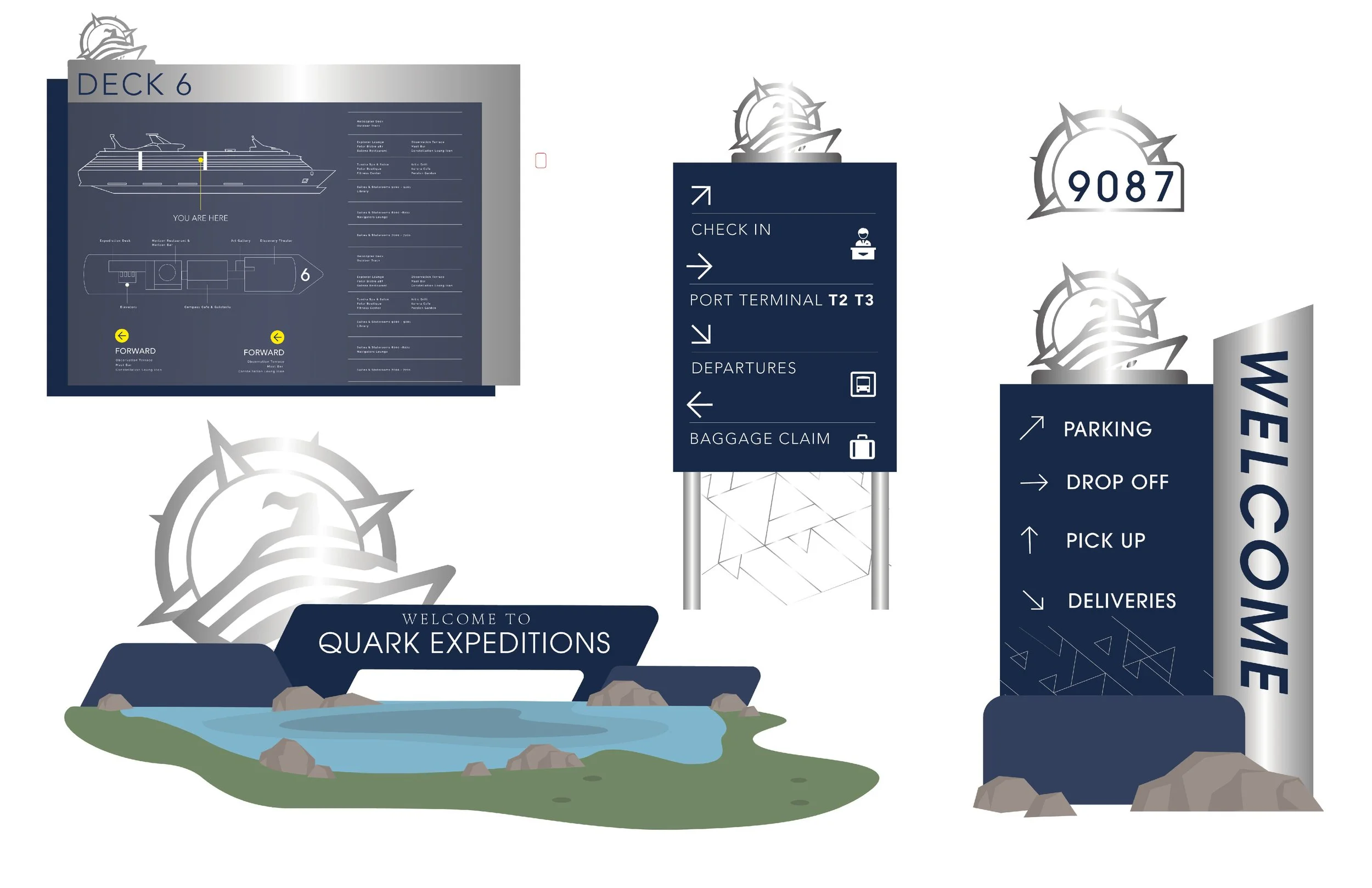
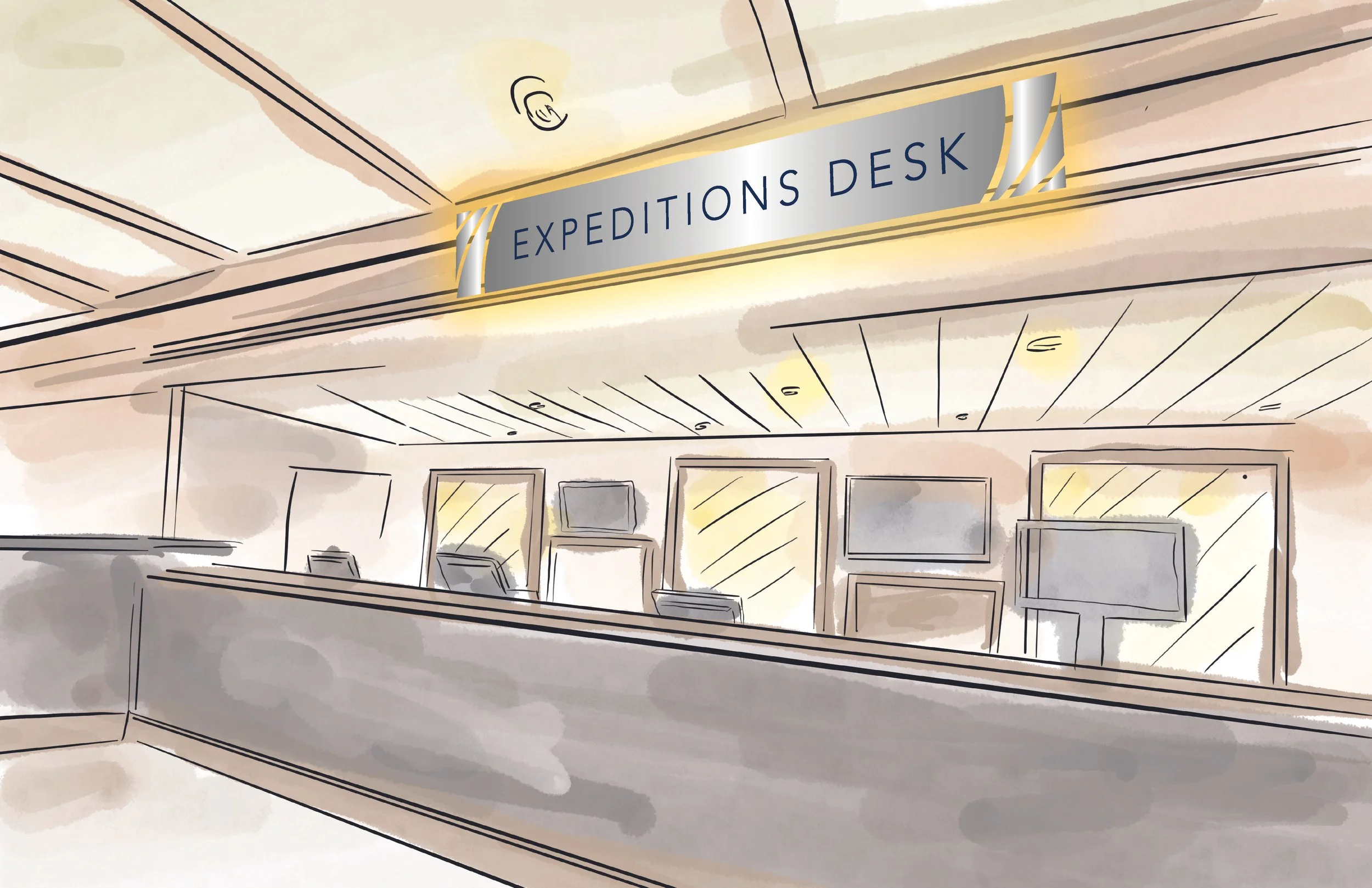
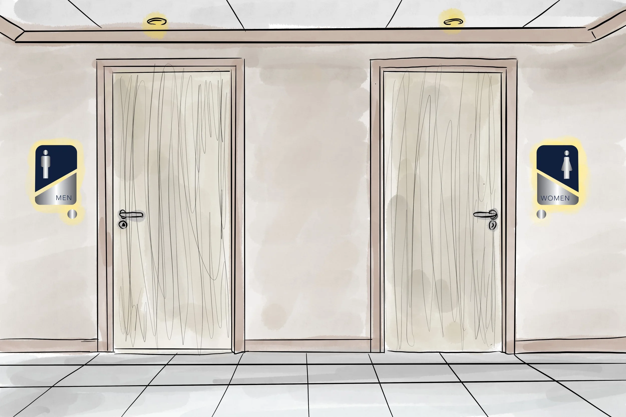
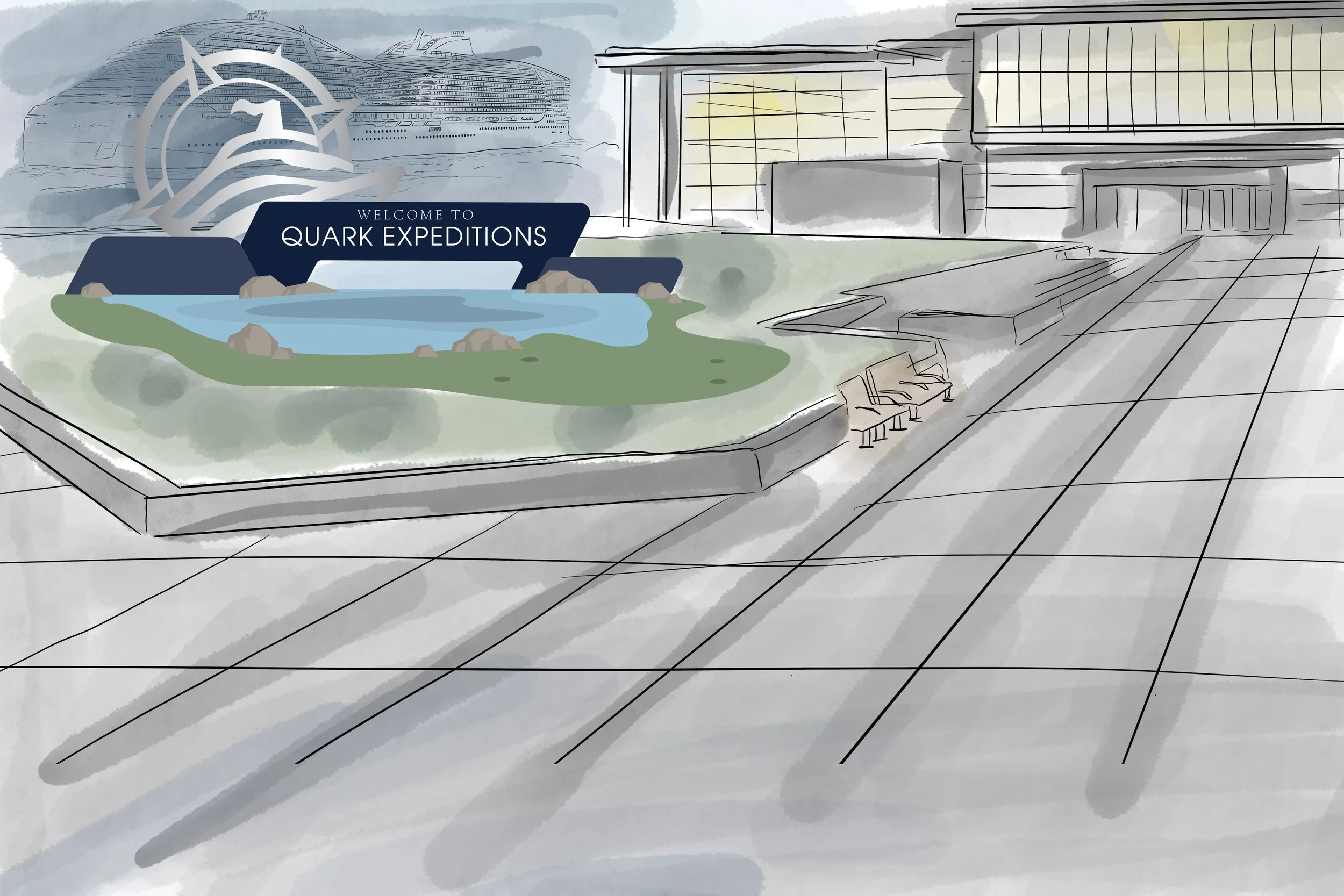
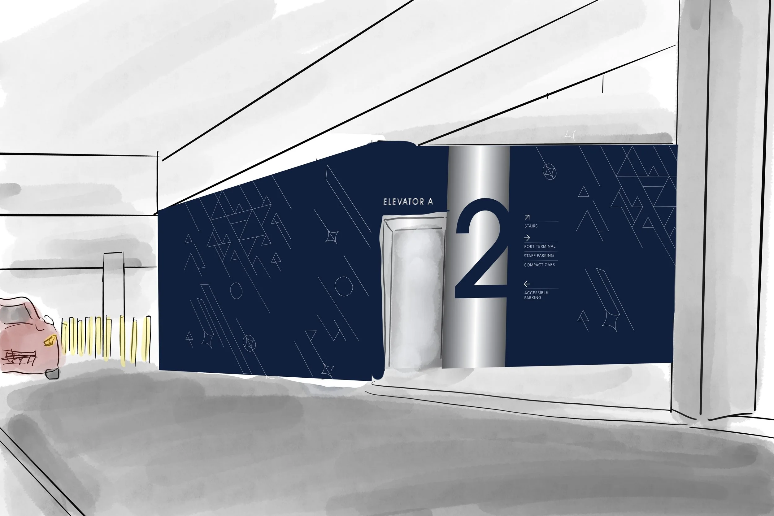
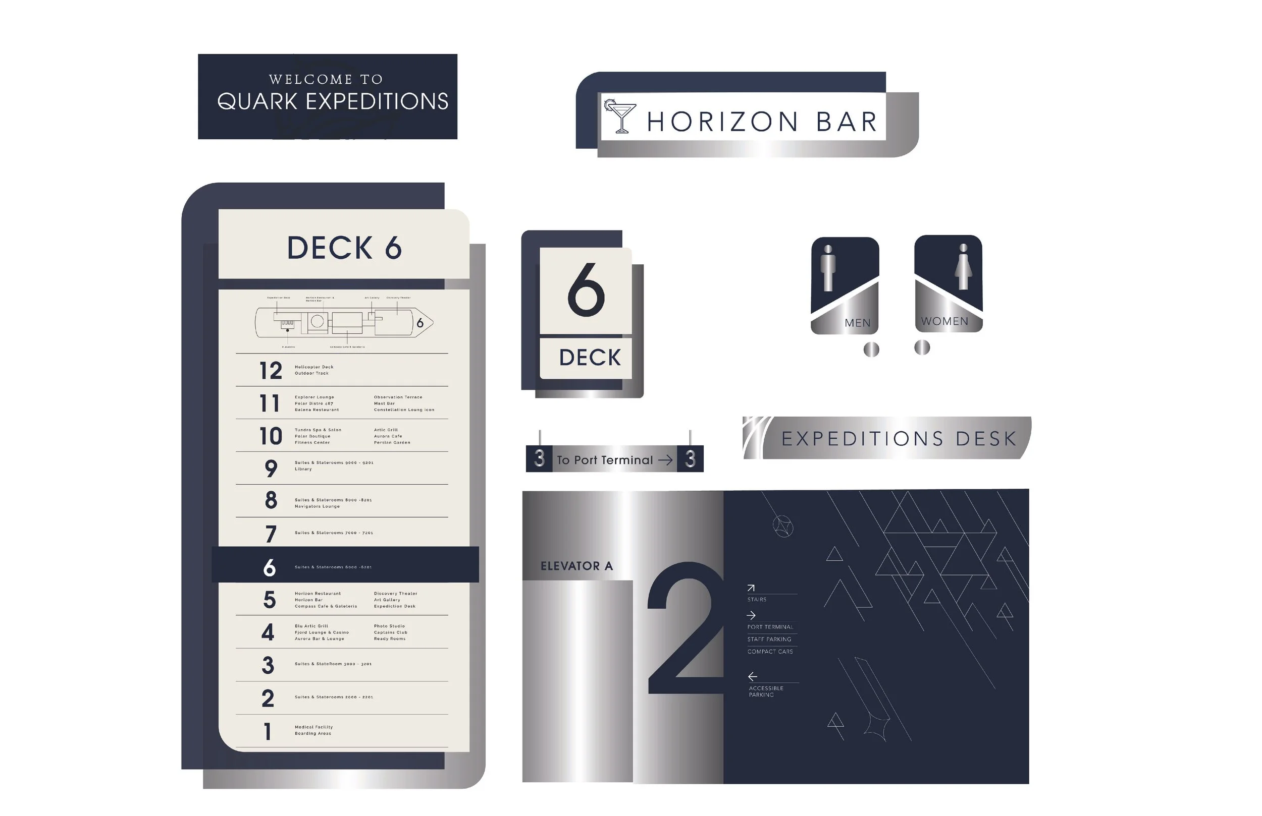
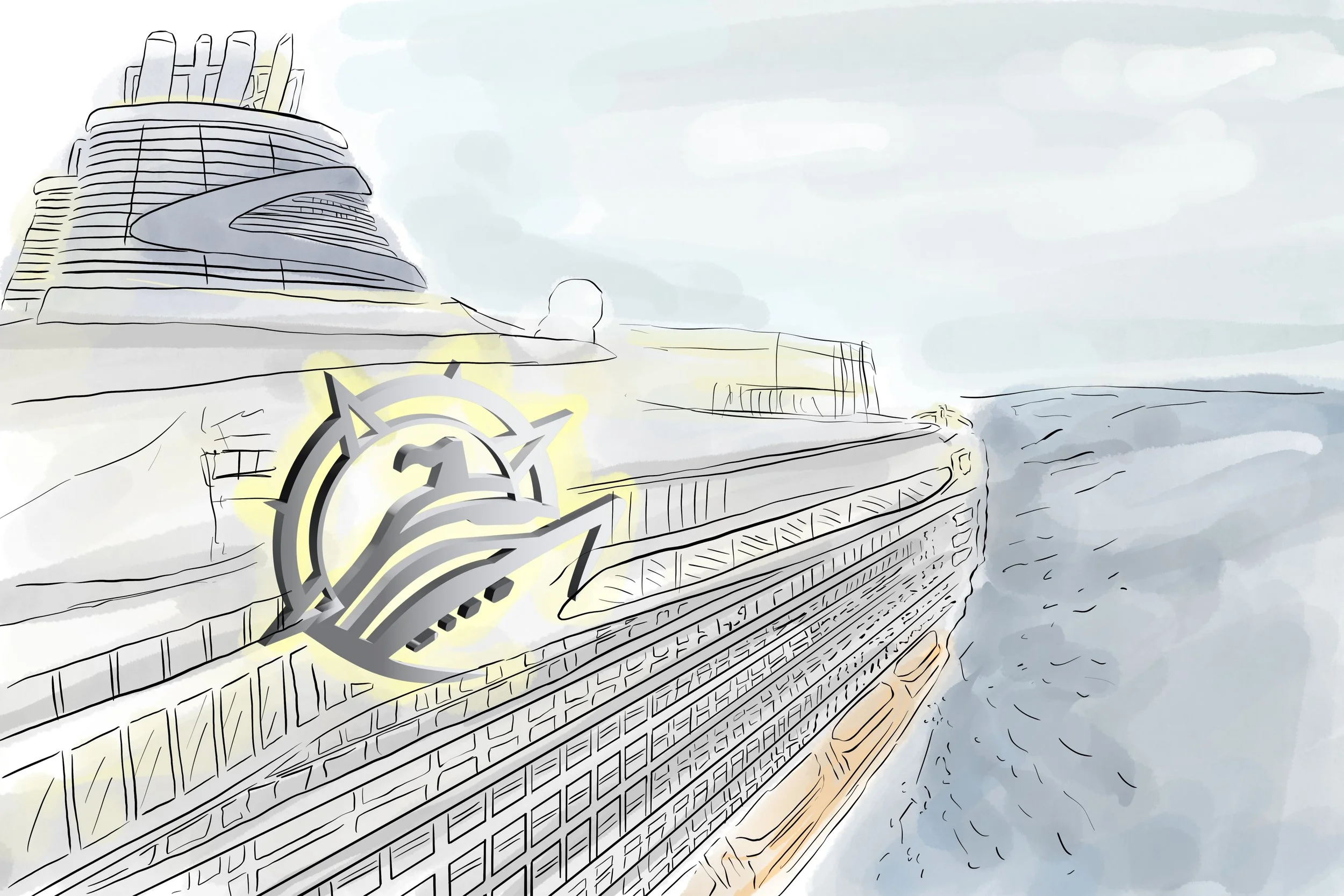
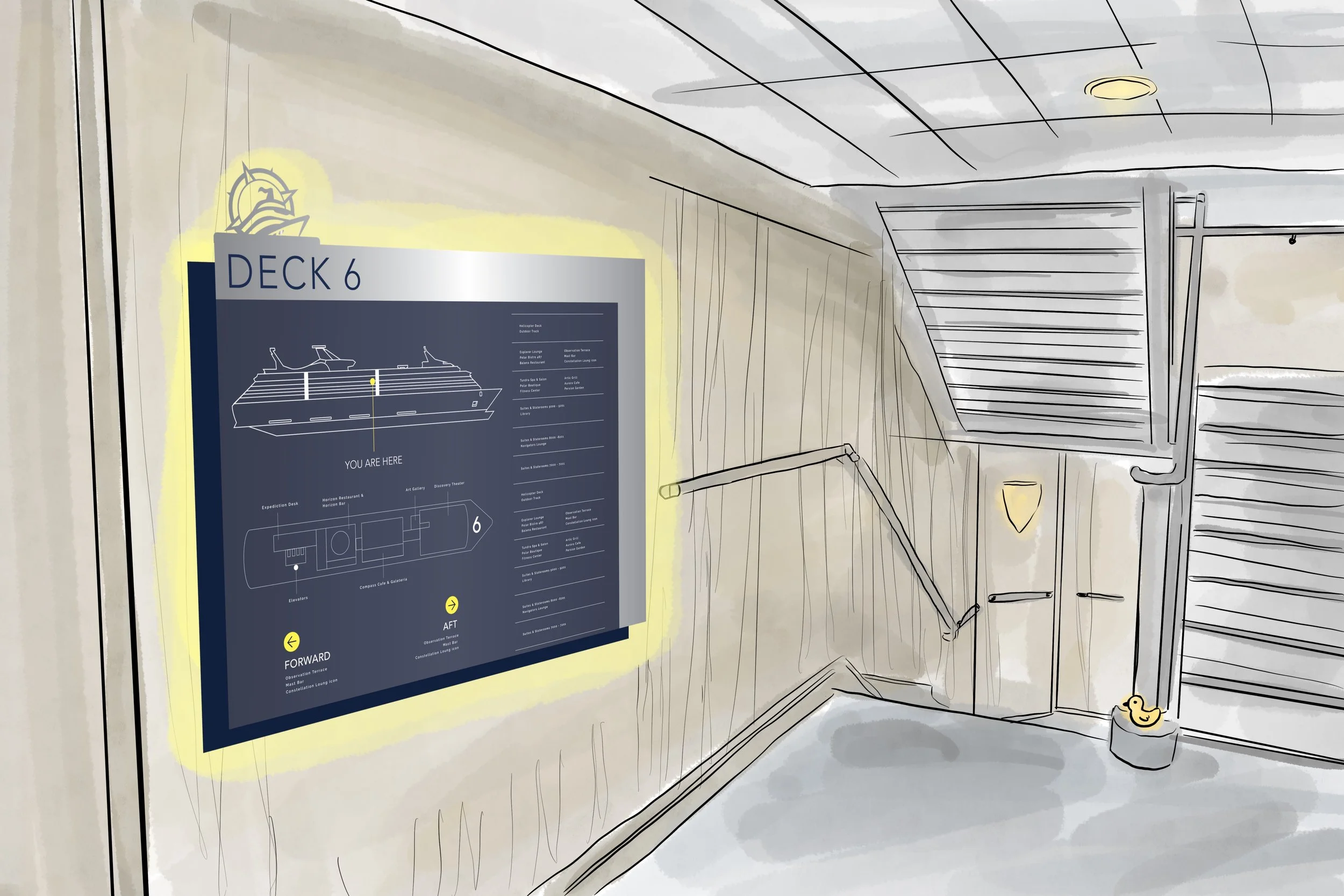
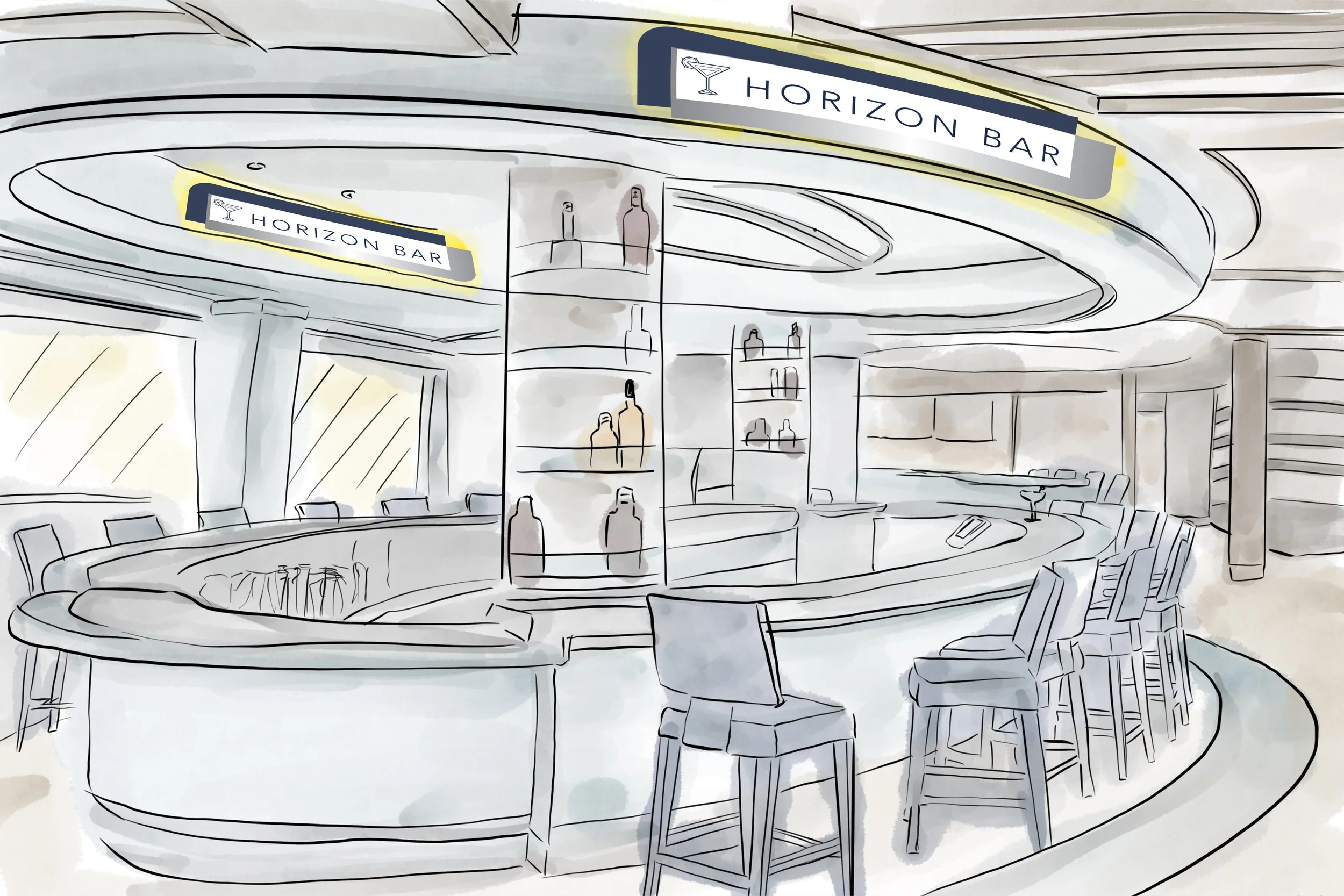
The Quark Expeditions rebrand reimagines the cruise experience through a refined, Arctic-inspired visual system. The identity shifts to cool blues and grays with a simplified, modern mark. The project spans way-finding and onboard materials supported by fully illustrated environmental renderings that visualize and define the complete spatial experience.


PROCESSES
Started with moodboarding and logo research, then logo & matching sign sketches and type exploration. Hand-drawn illustrated renders for final signage display.