
CAPTIVA ISLAND STORE
RE - BRAND | ENVIRONMENTAL DESIGN | PACKAGING
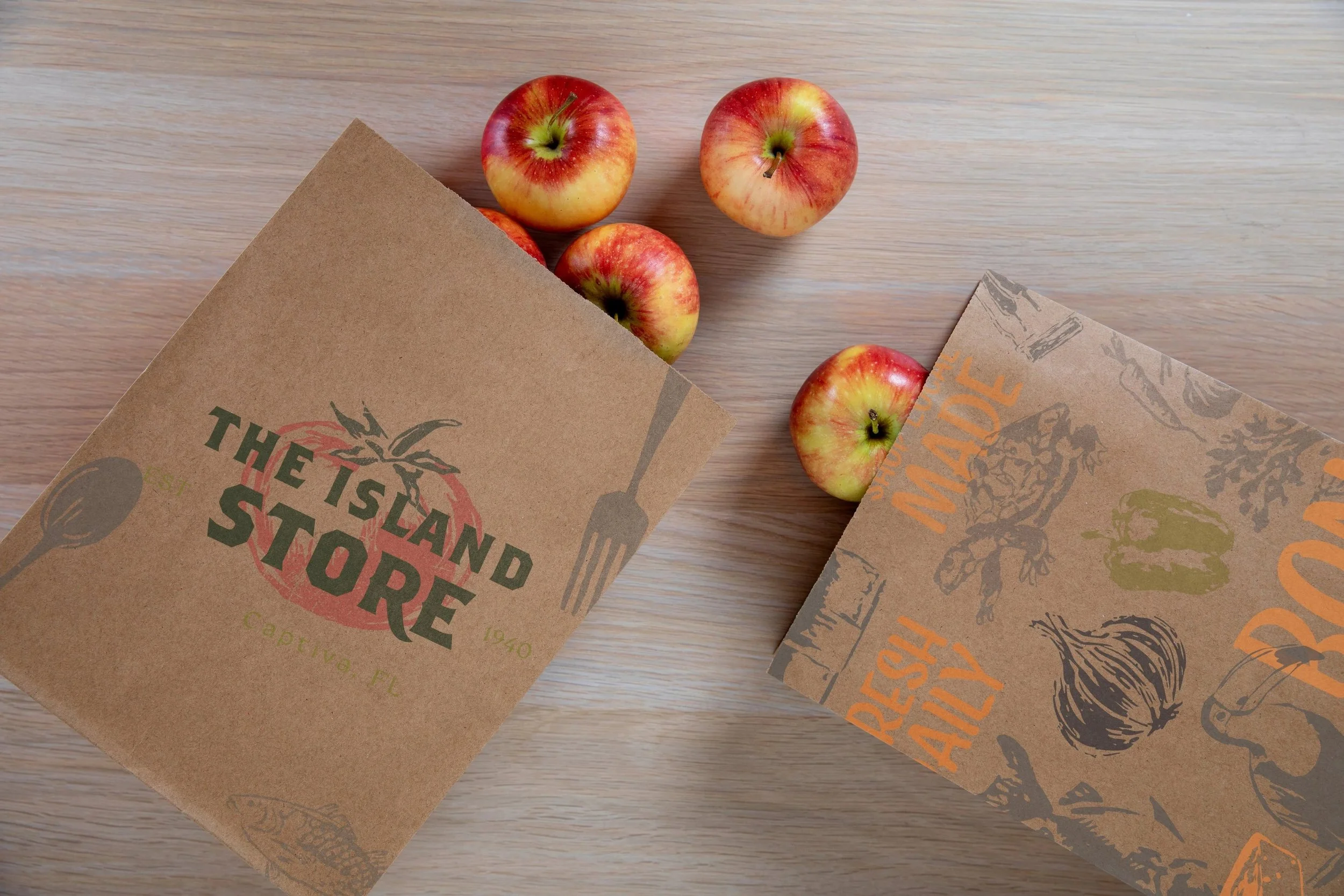
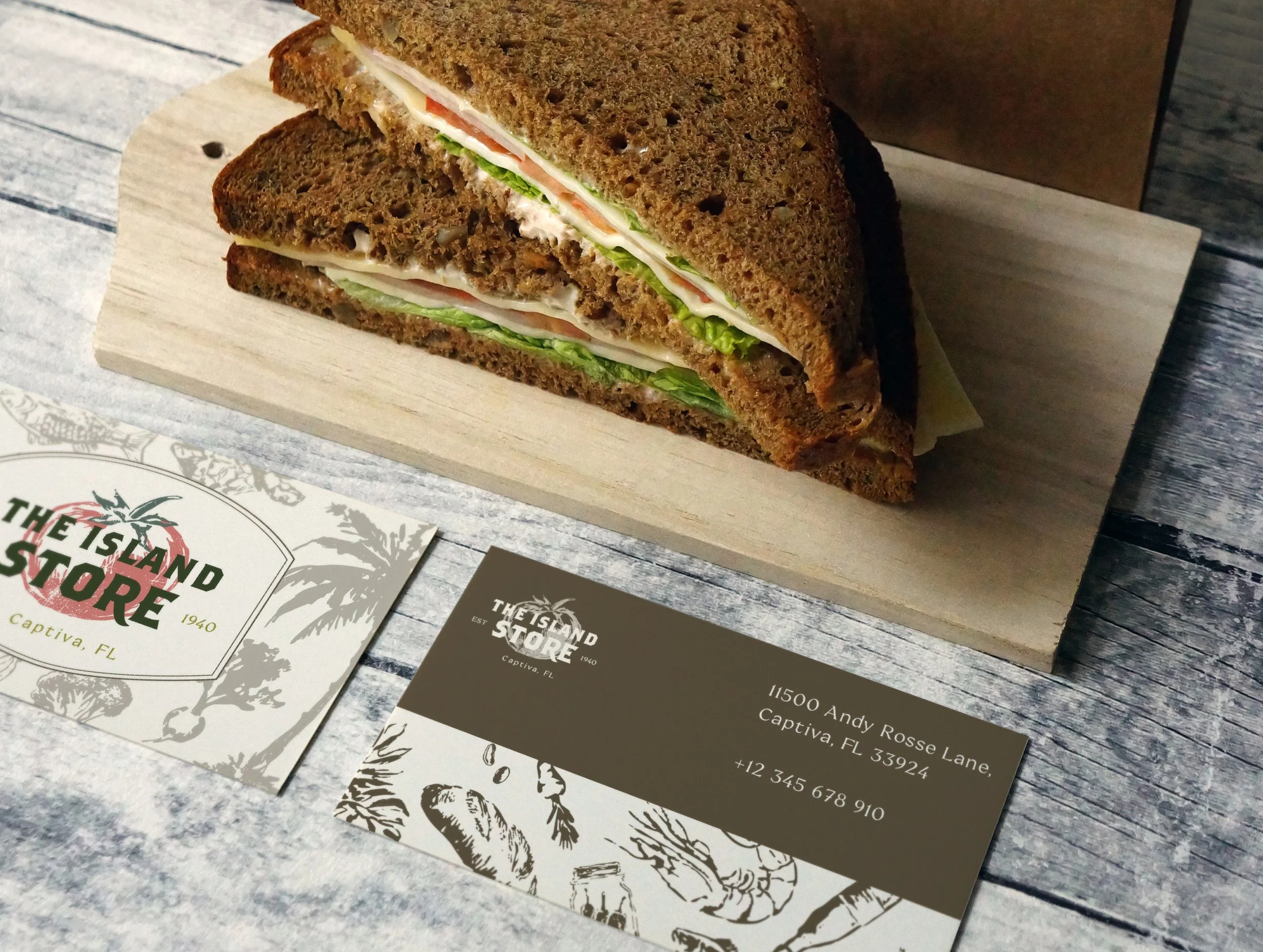
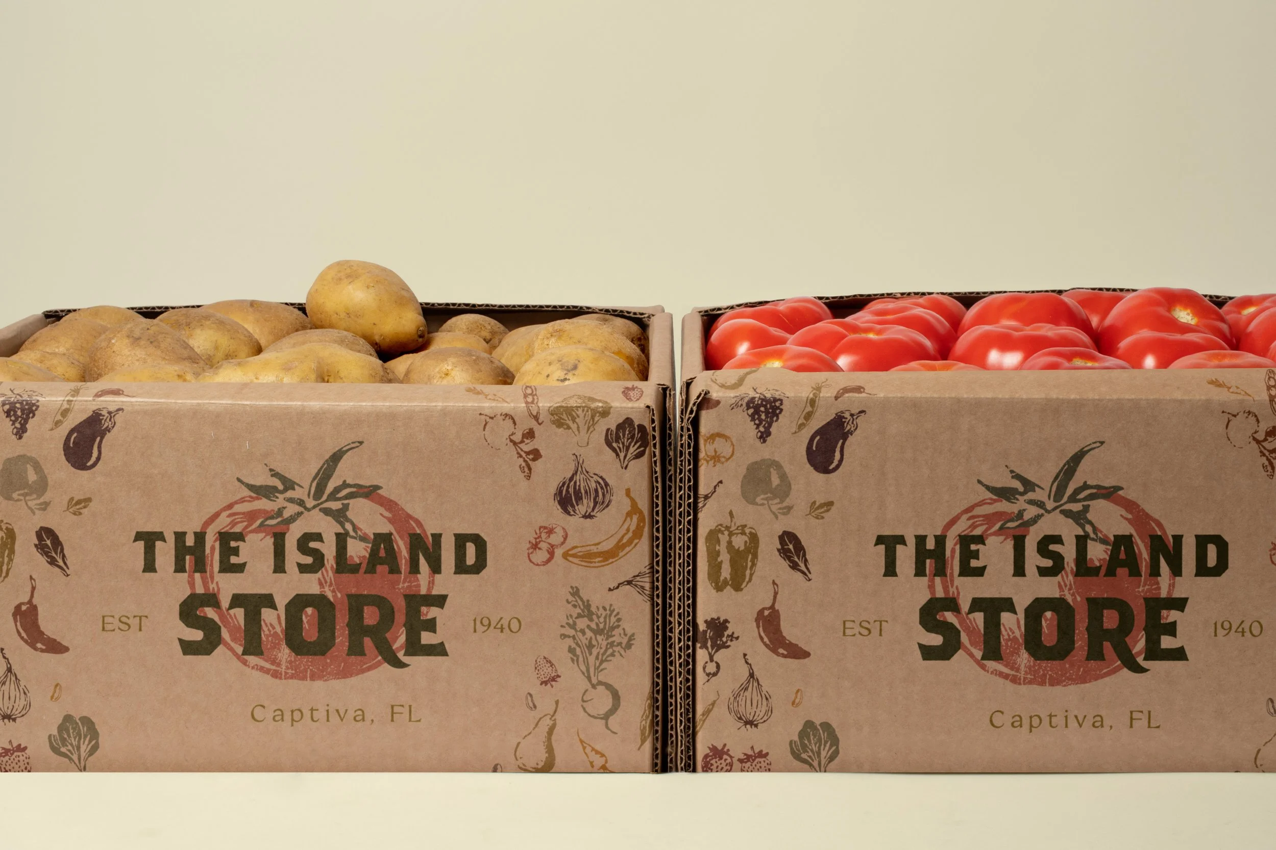
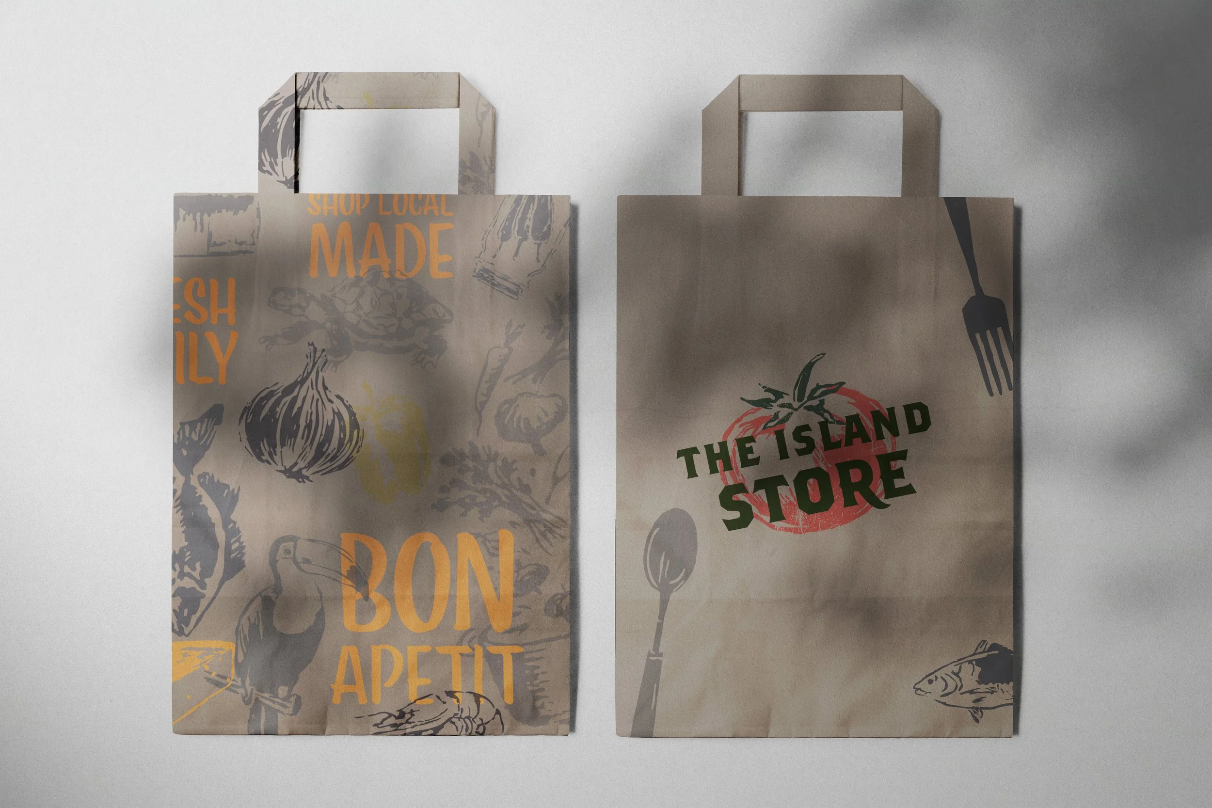
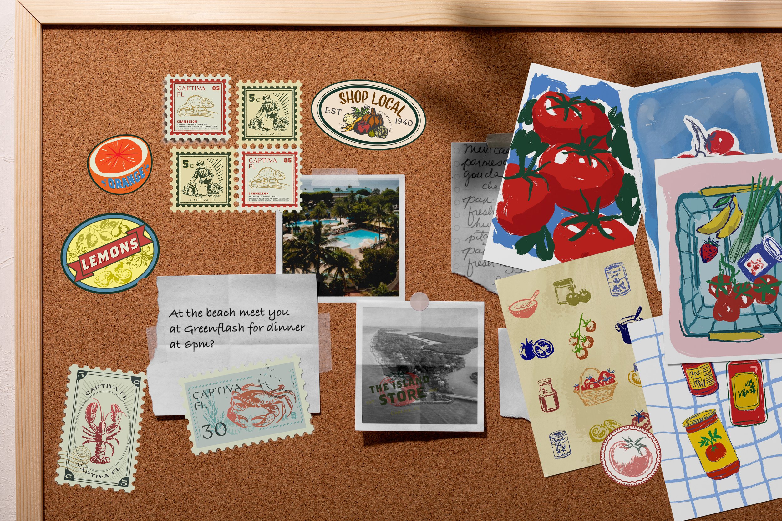
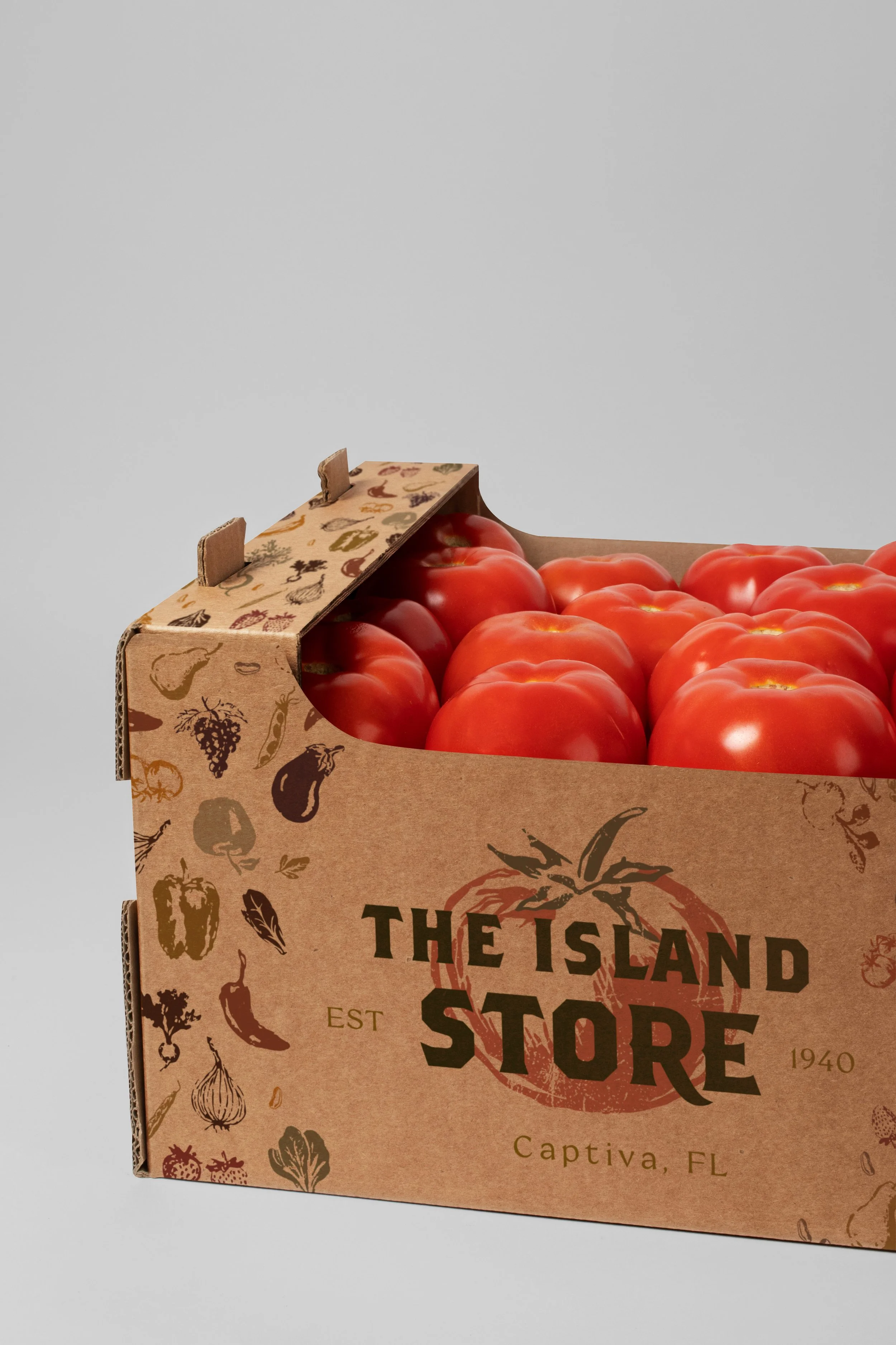
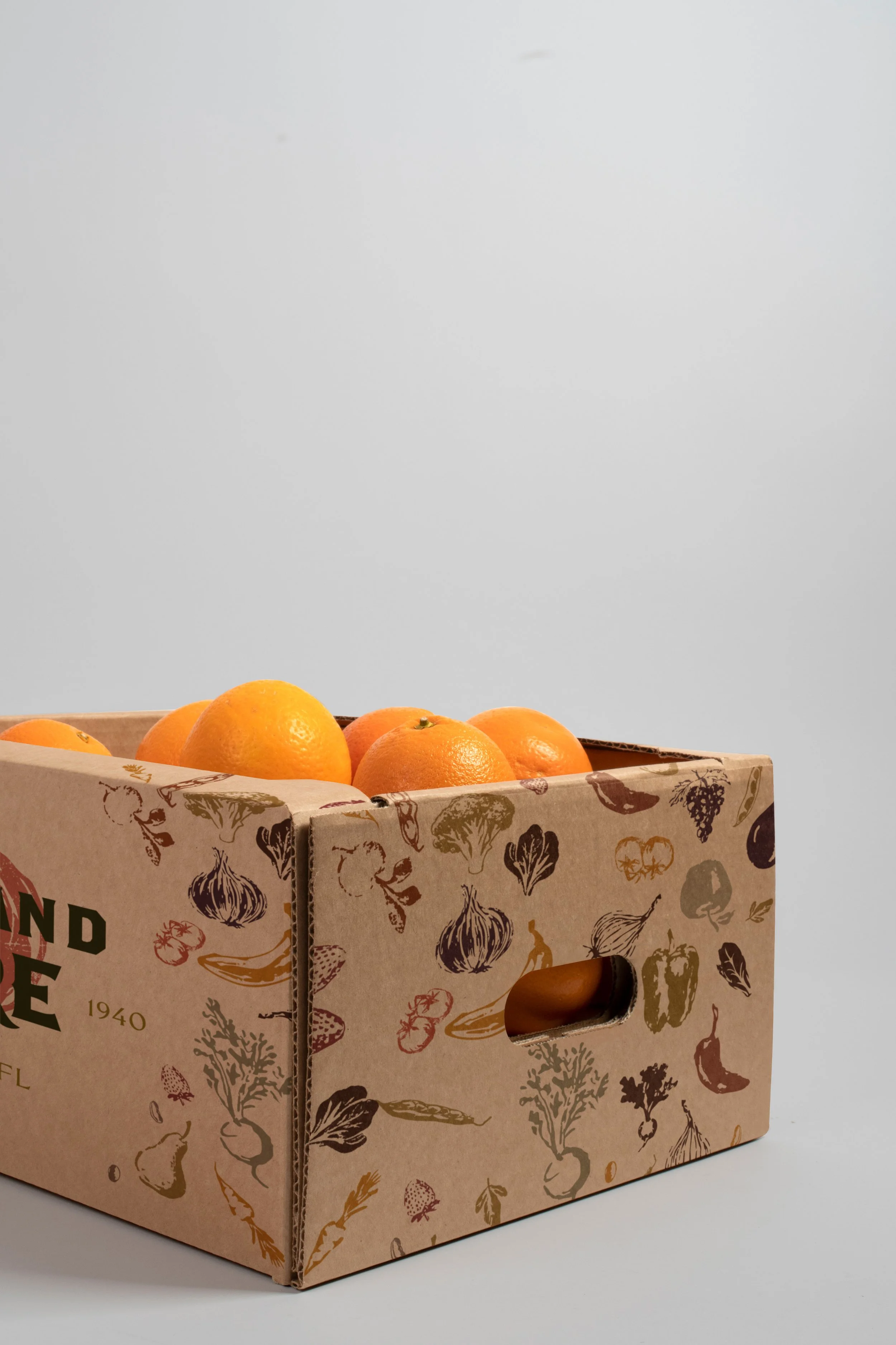
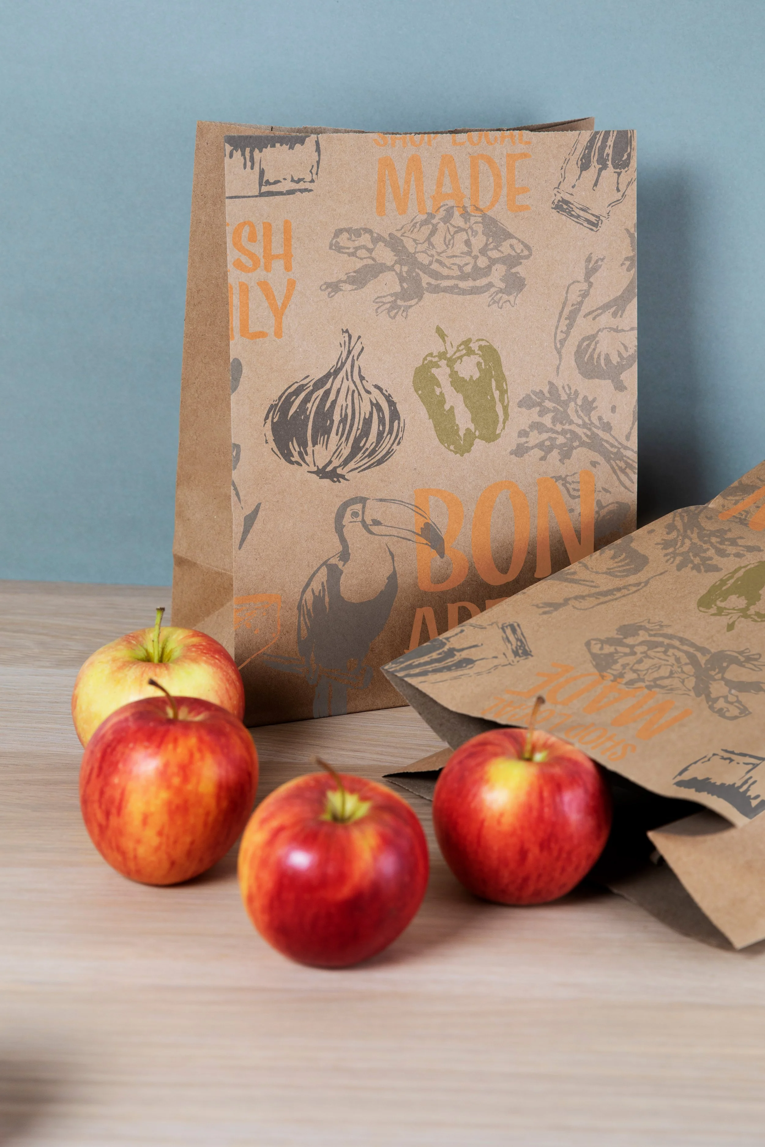
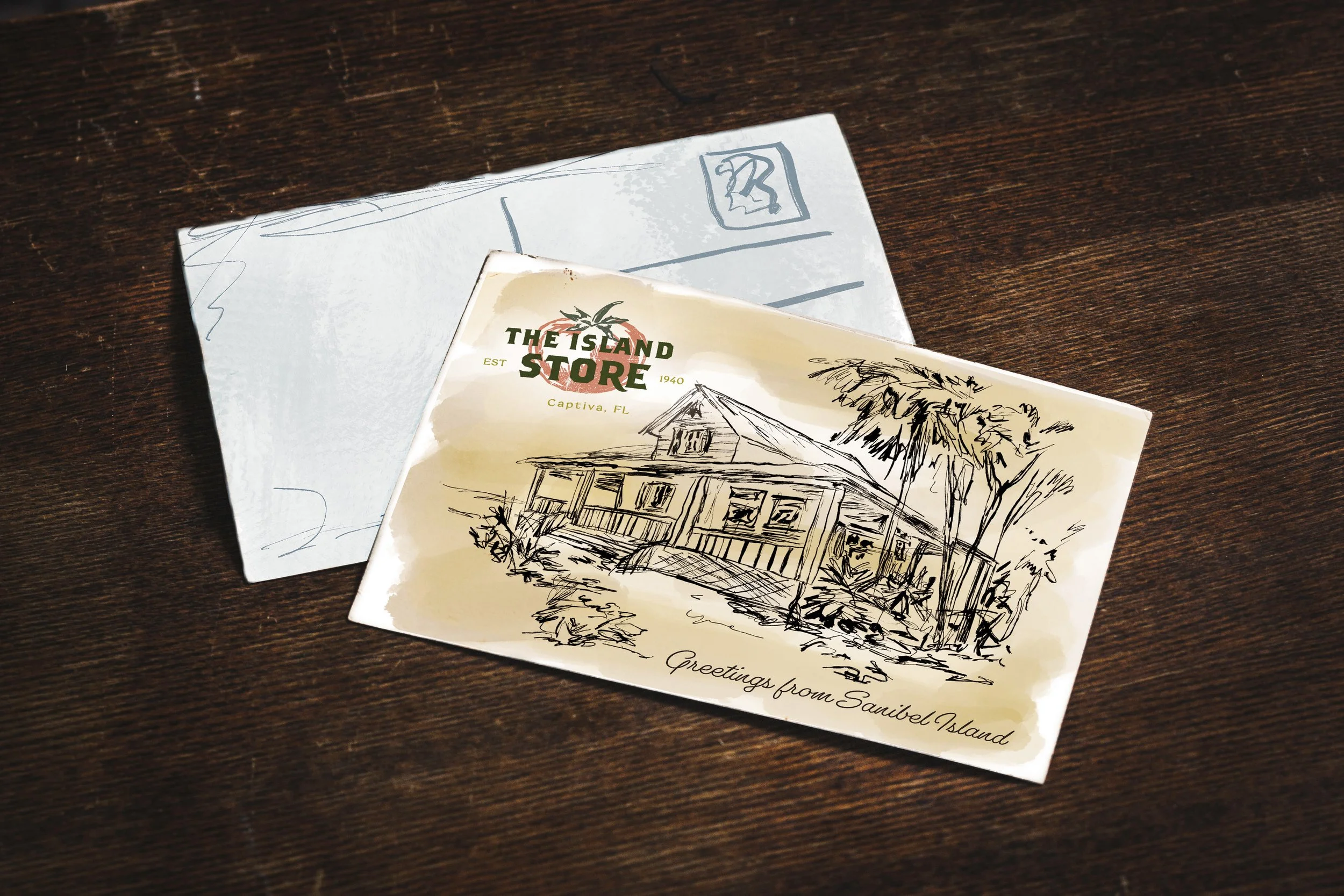
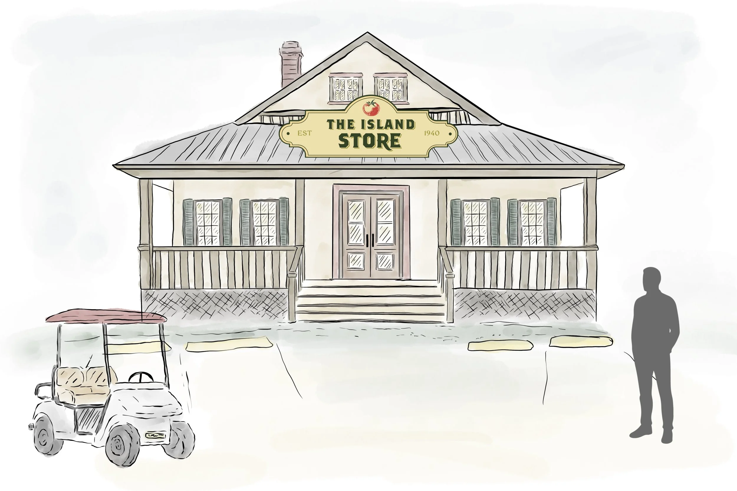
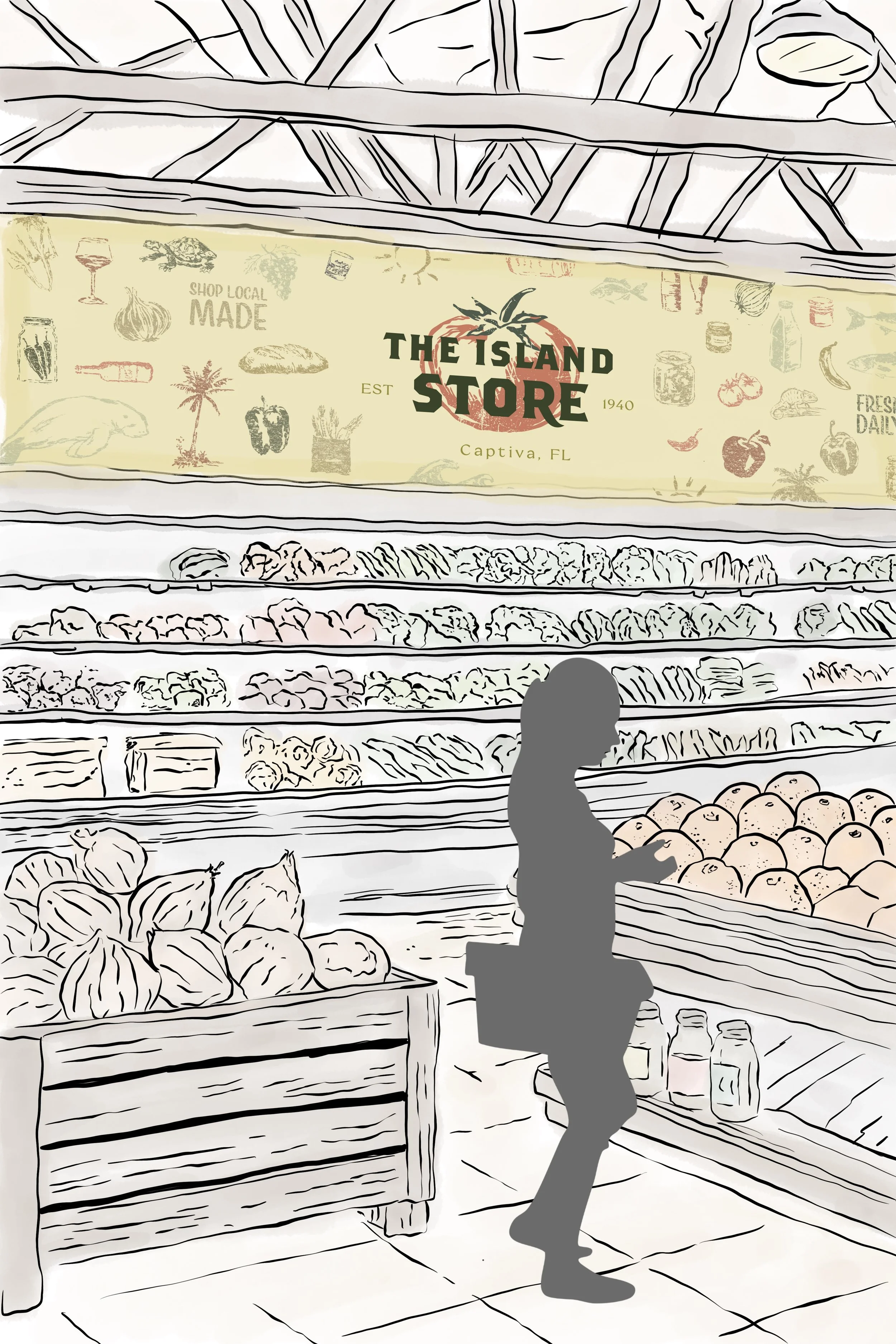
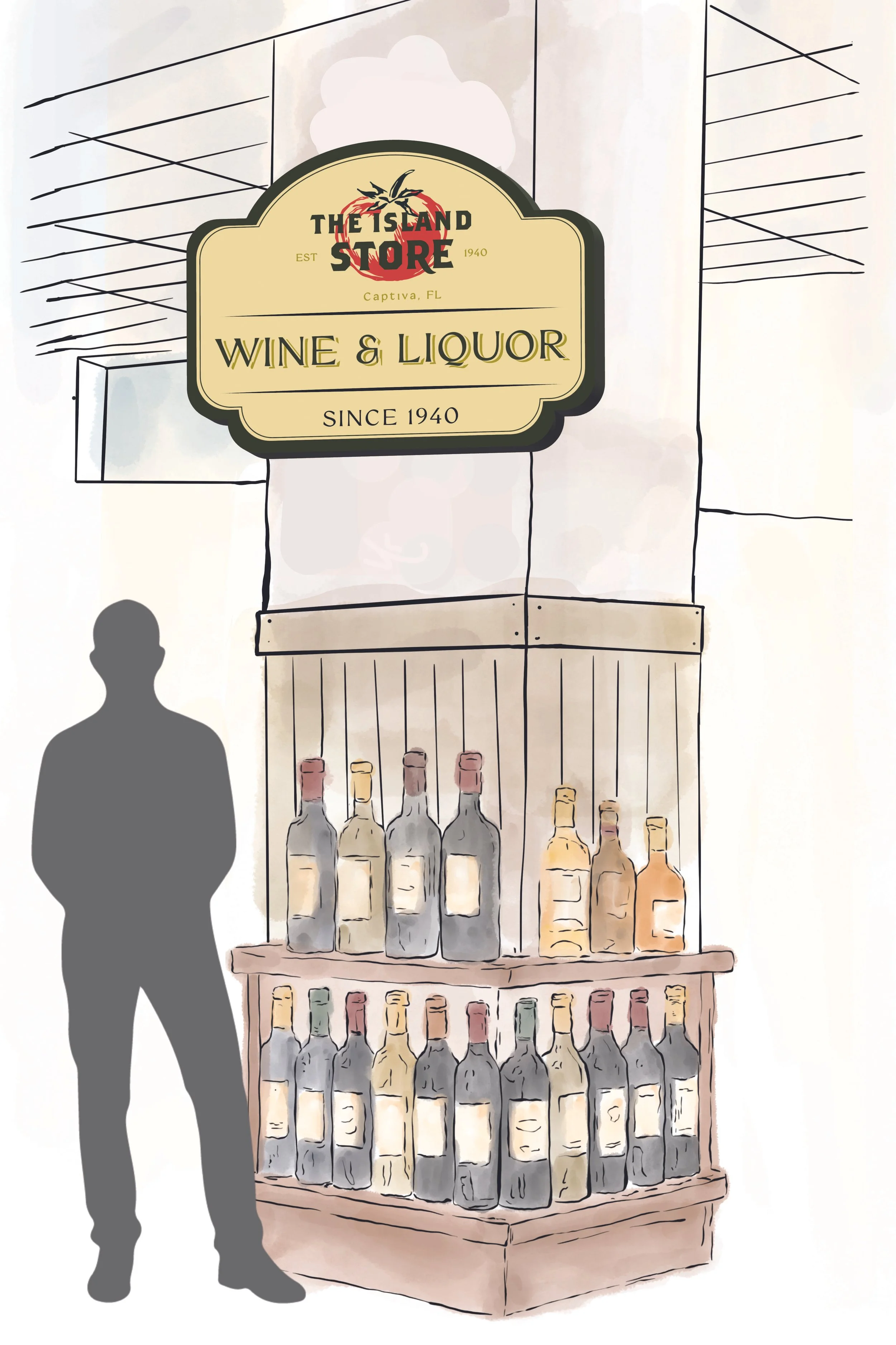
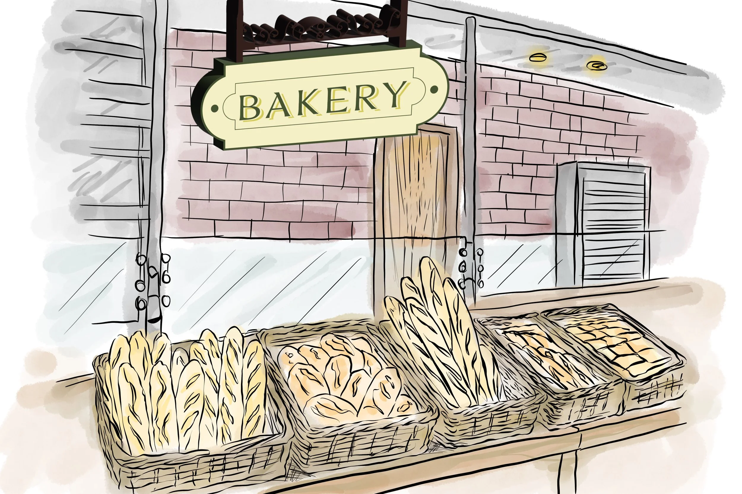
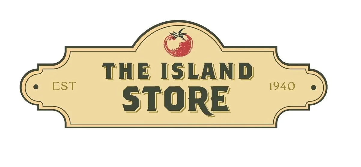
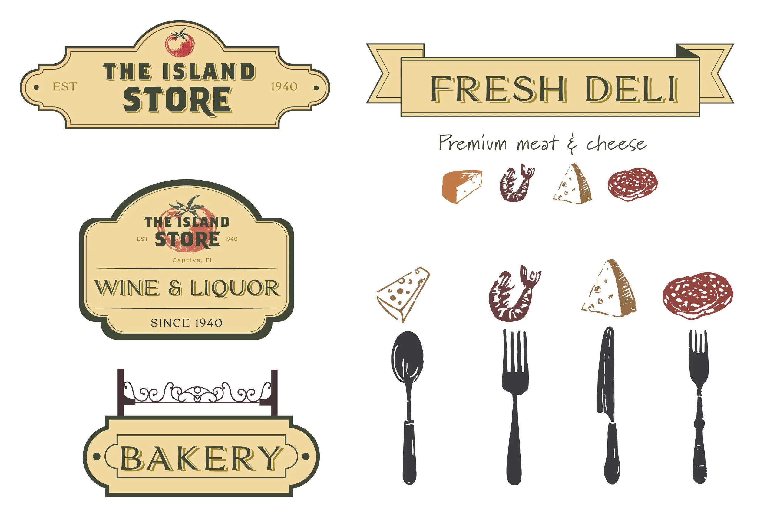
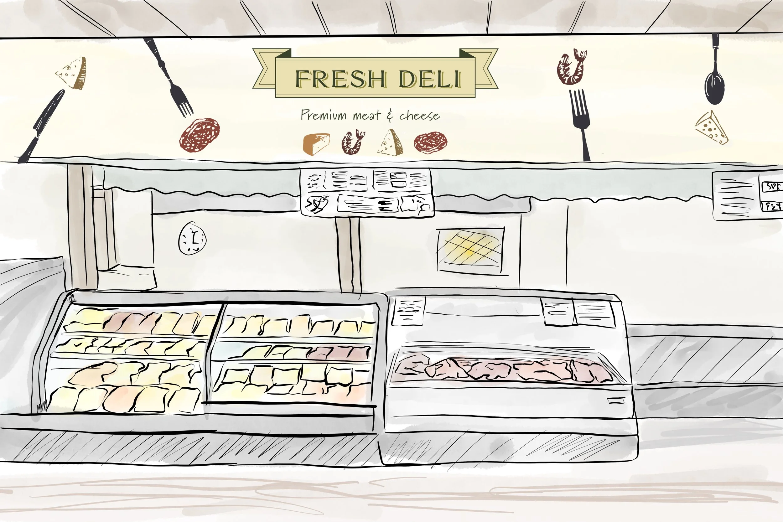
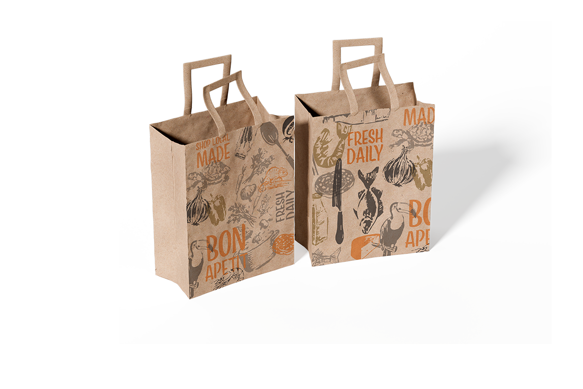
The Island Store was rebranded to capture a vintage, nostalgic island feel that reflects the charm of original Captiva Island. The updated identity includes a refined logo, clear grocery signage, and a cohesive illustration style carried across postcards, stickers, produce labels, and packaging. The result is a unified, timeless brand that feels both authentic and inviting.


PROCESS
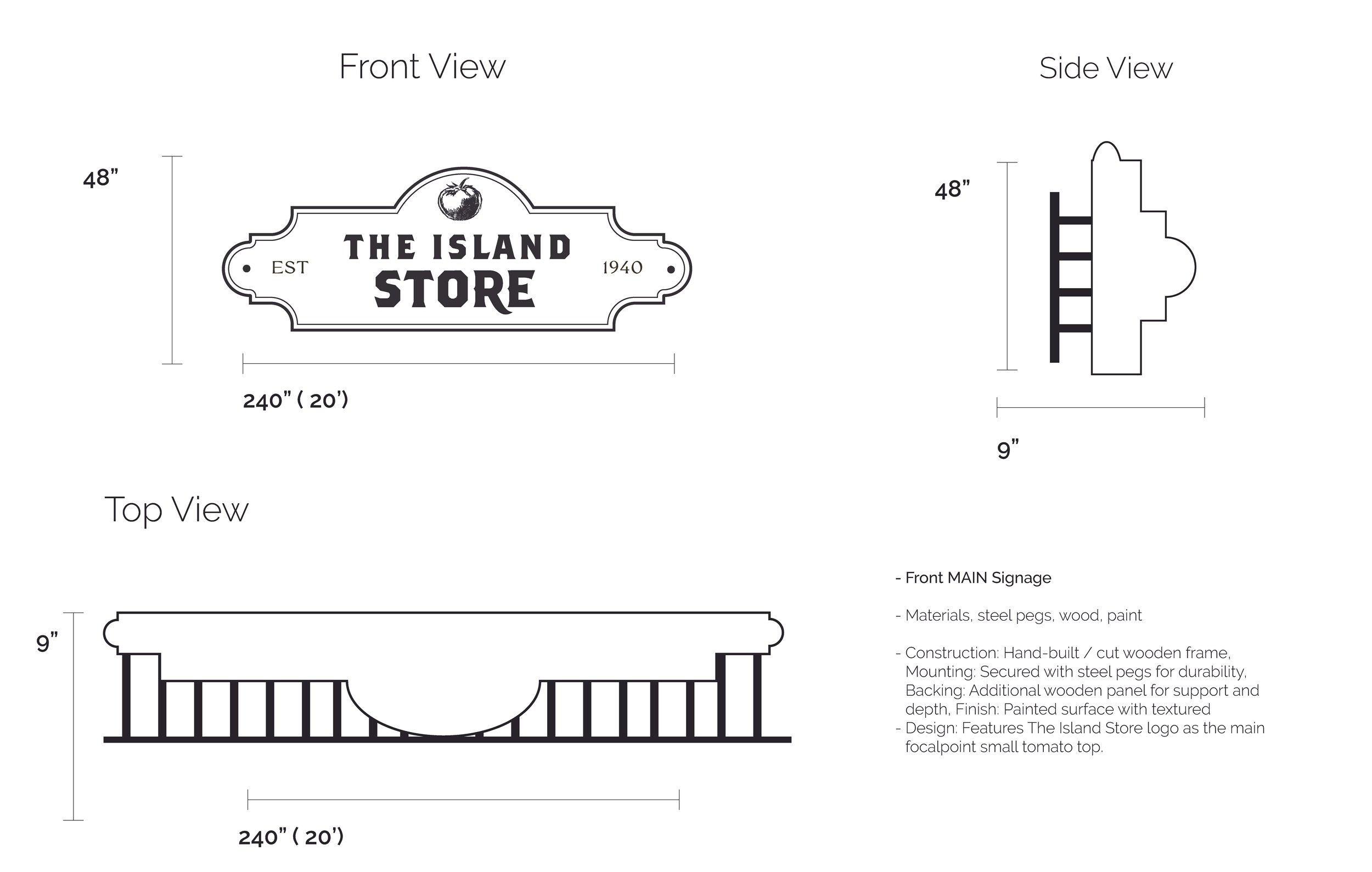
Process began with research, mood boarding, and sketching for logos with a matching signage. before logo type studies, logo comps. All render were sketch rough and drawn digitally as well for postcards and extra print illustrations.