
QUARK EXPEDITIONS
RE - BRAND | ENVIRONMENTAL DESIGN | WAY - FINDING
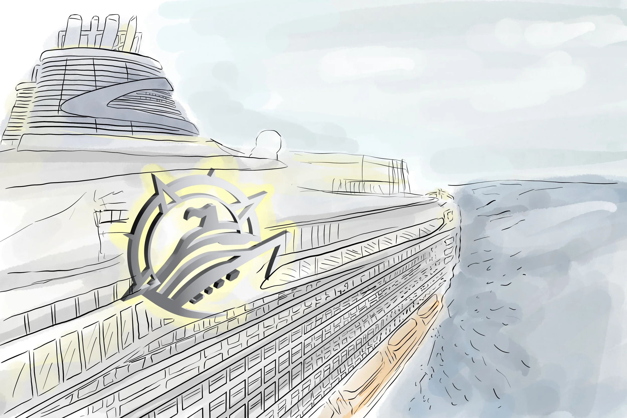
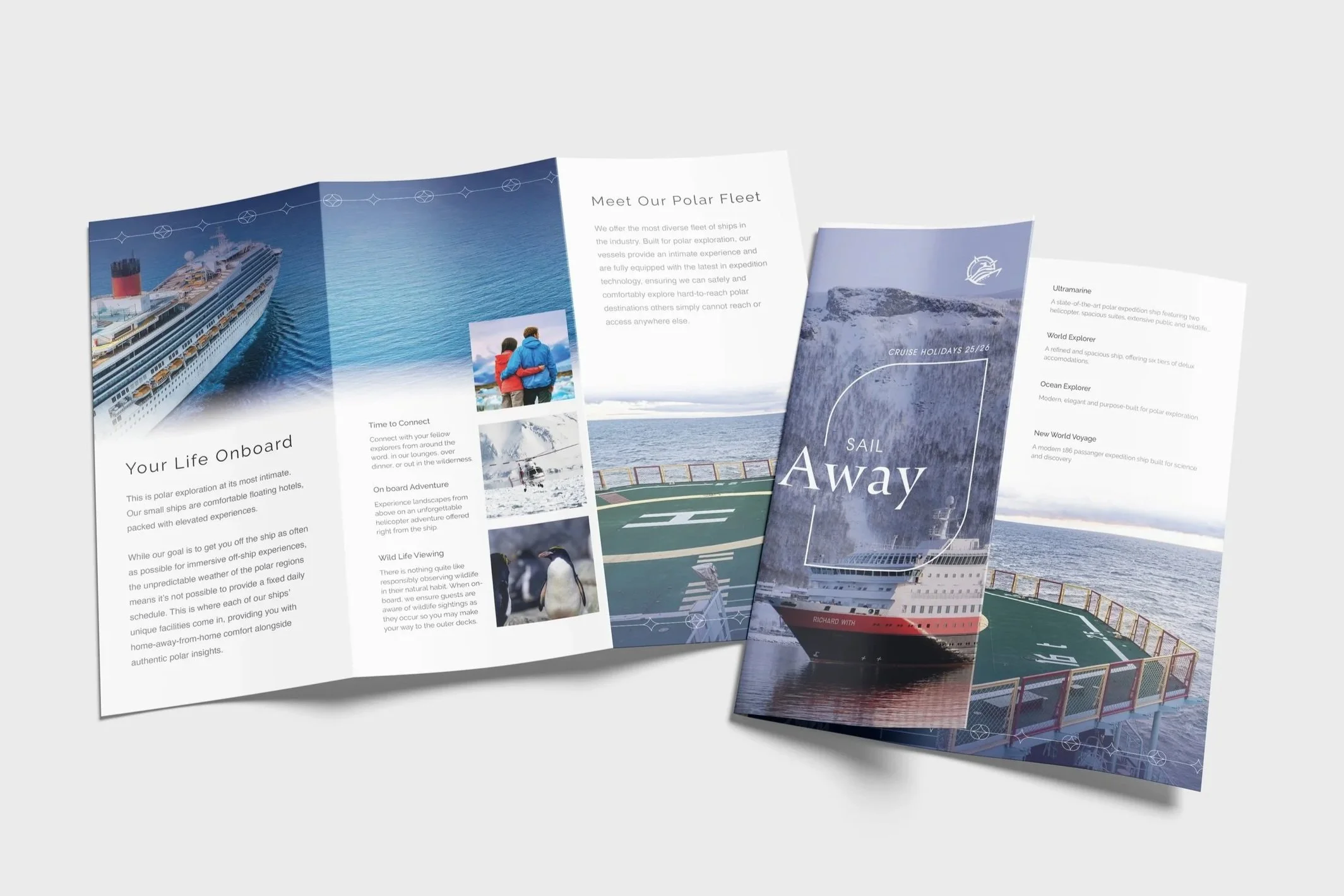
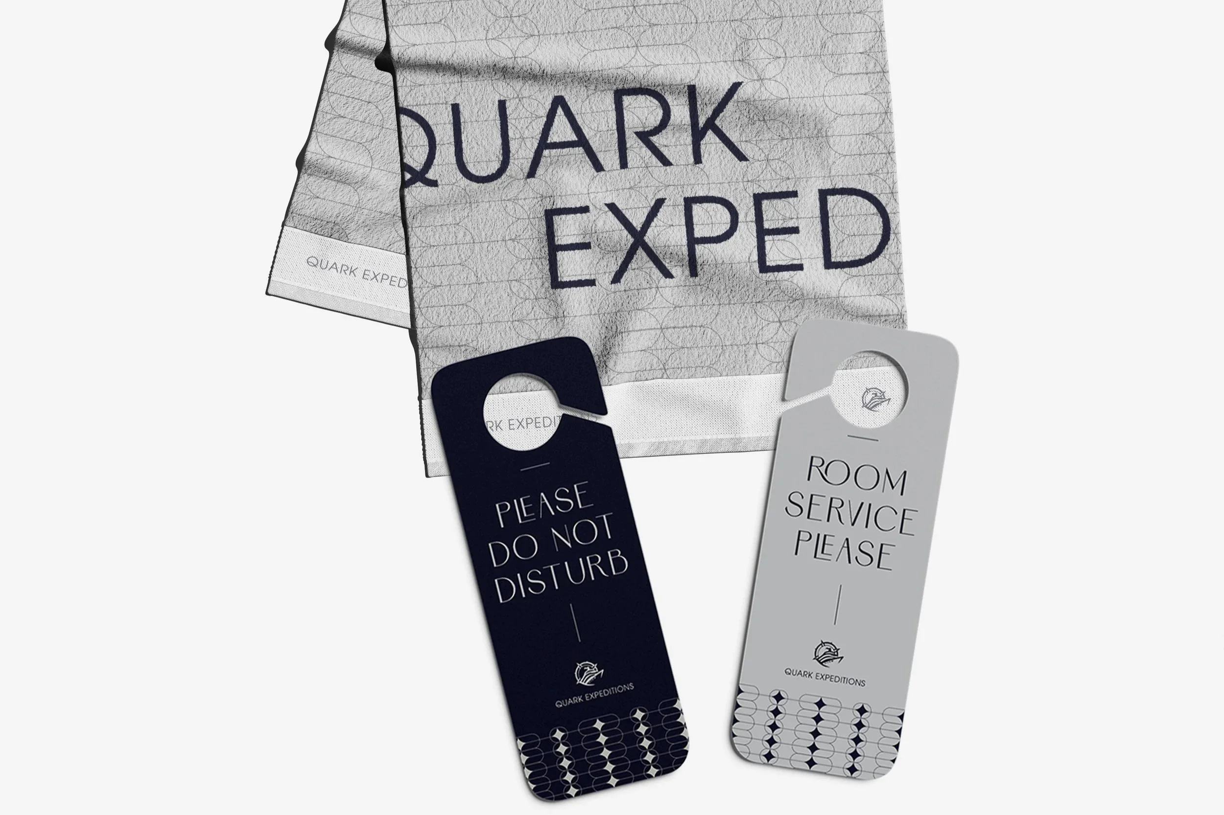
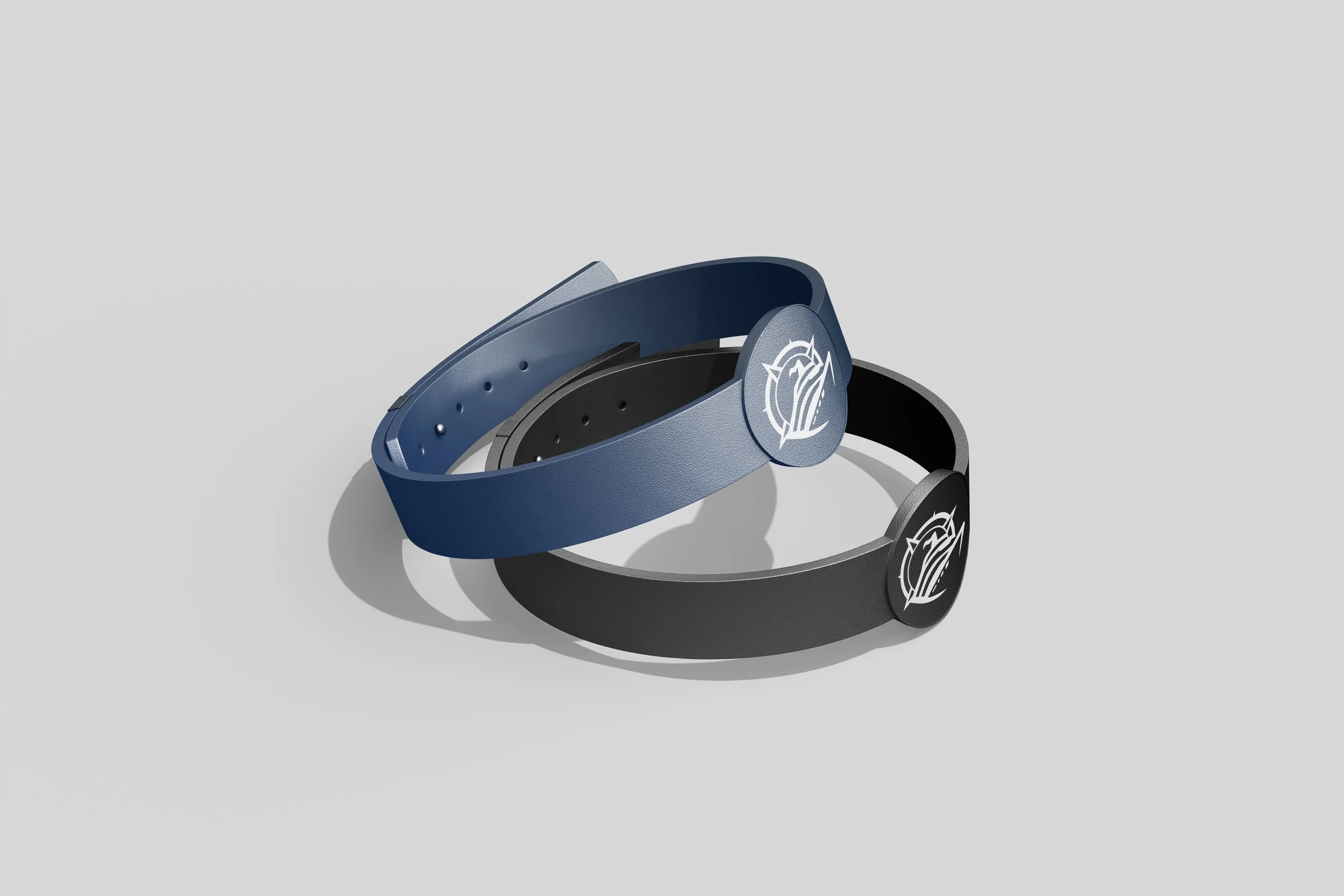
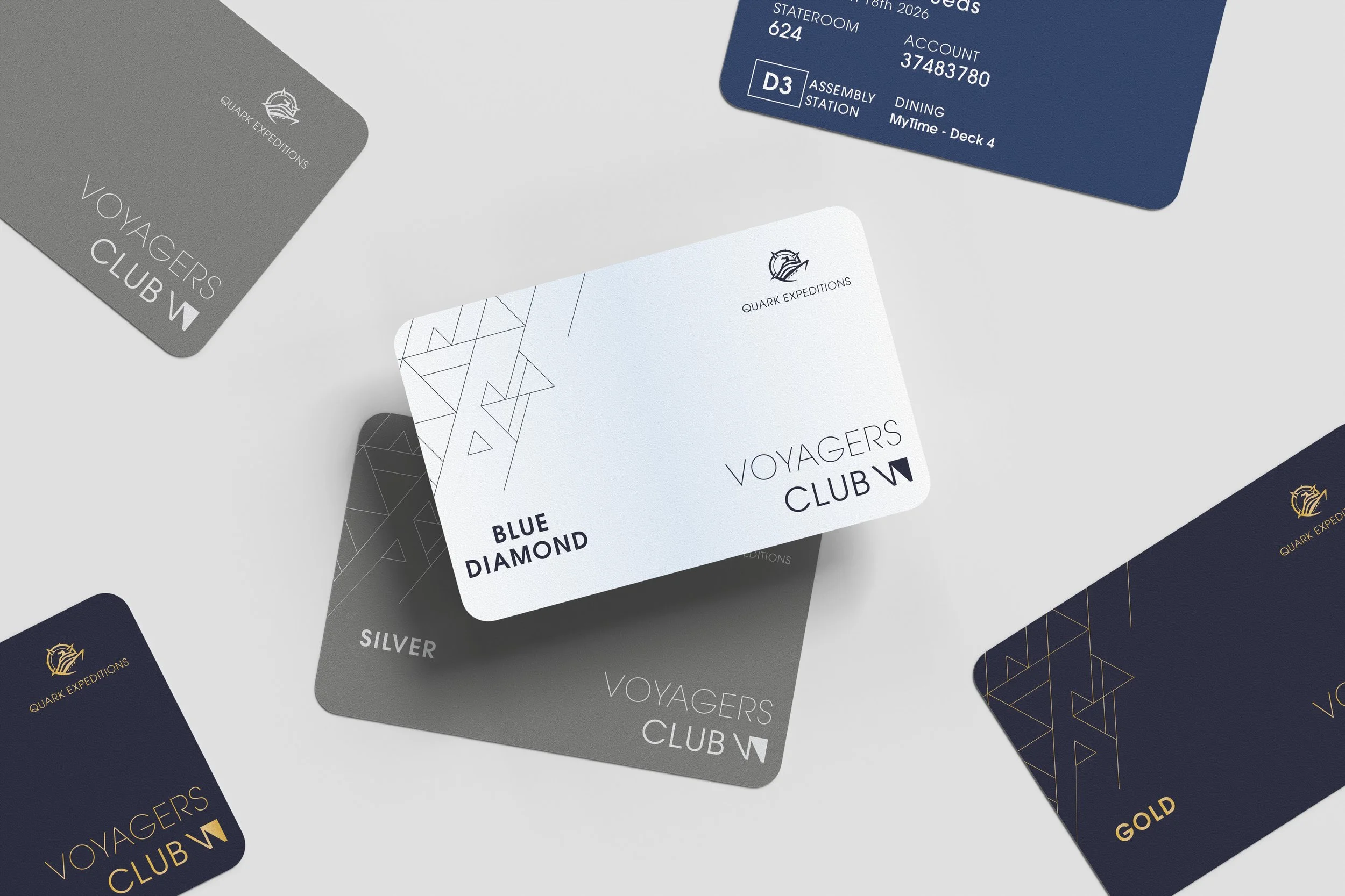
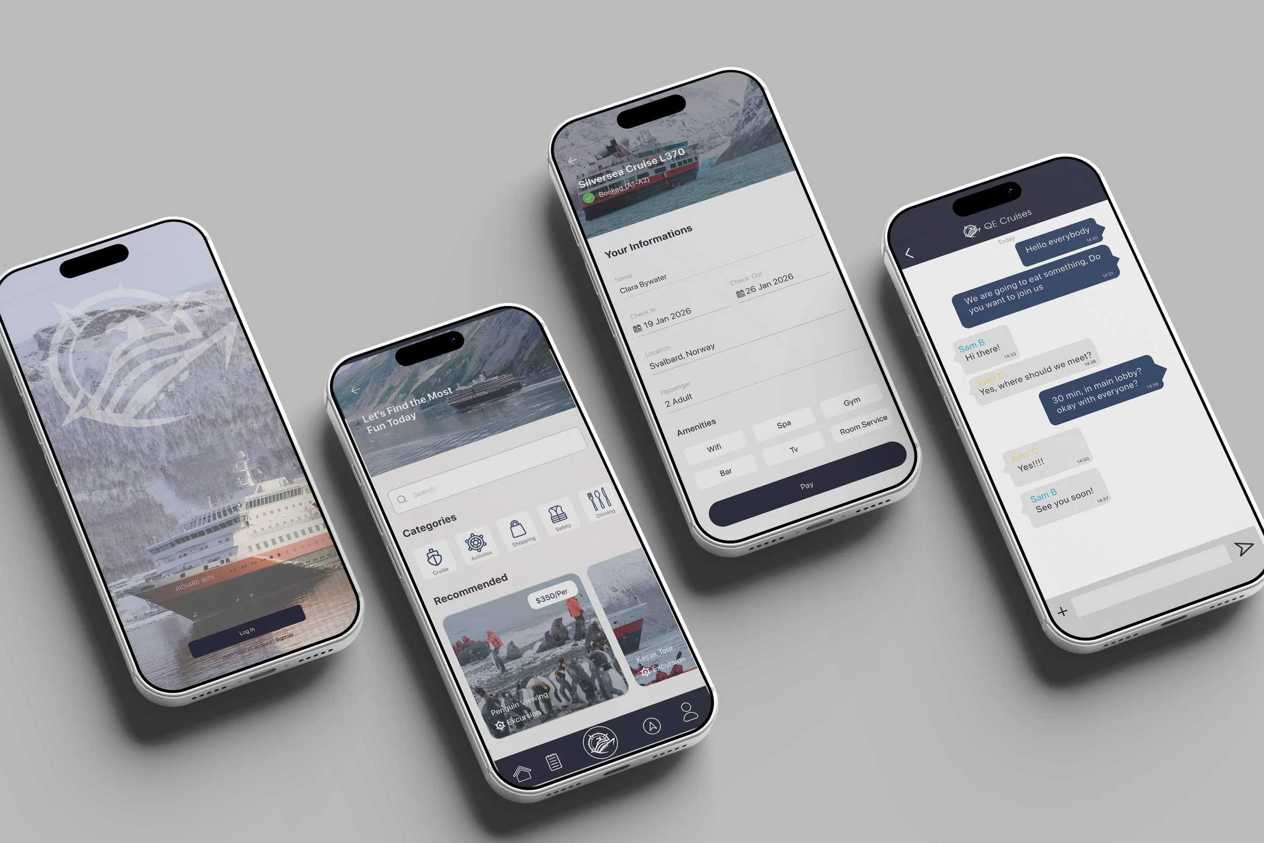
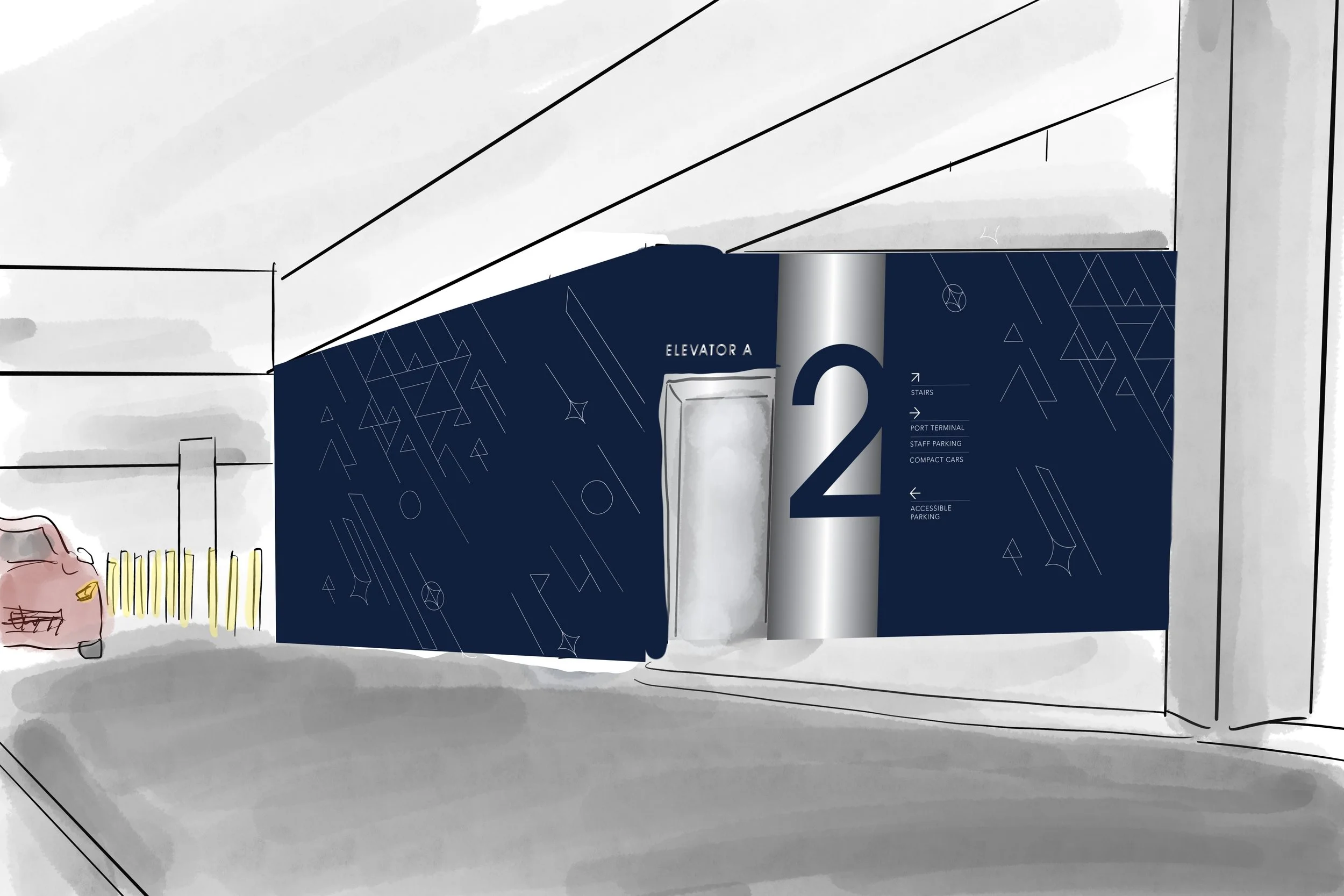
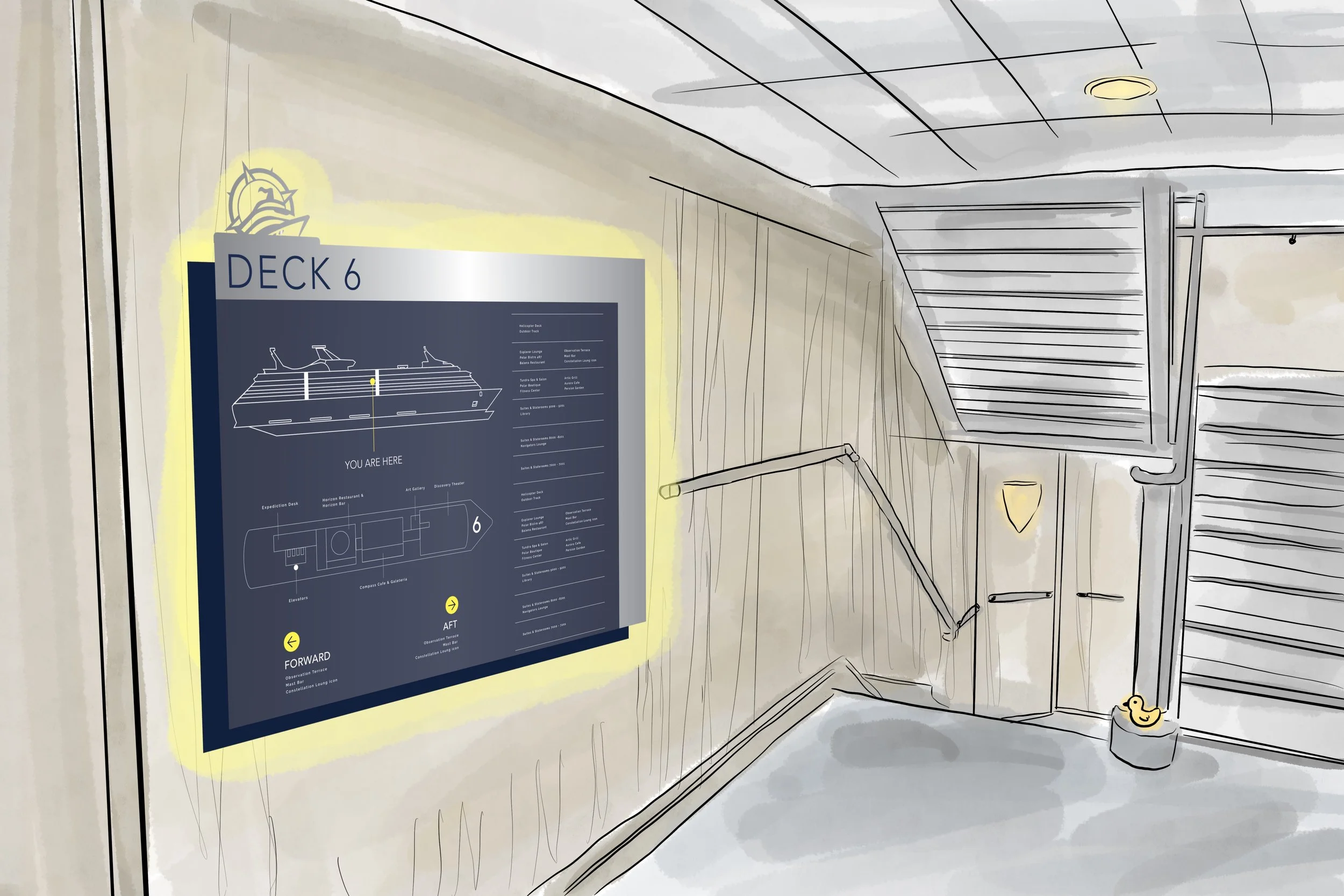
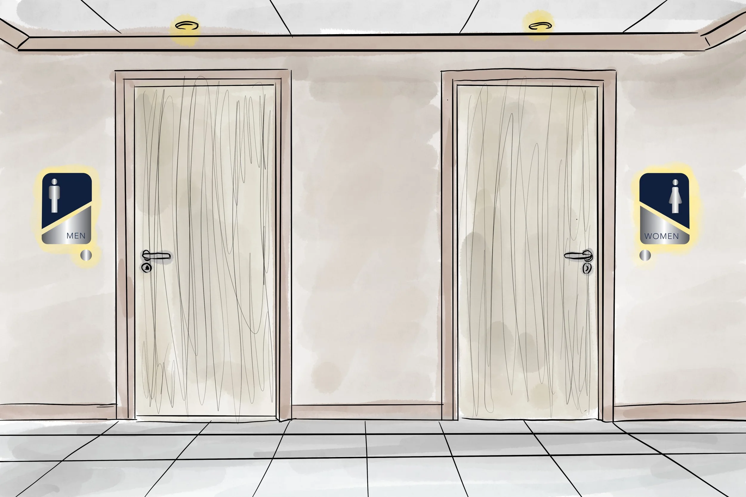
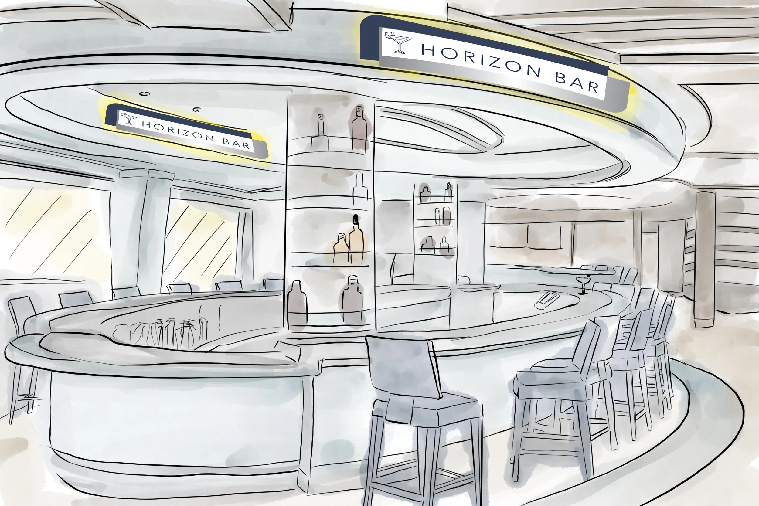
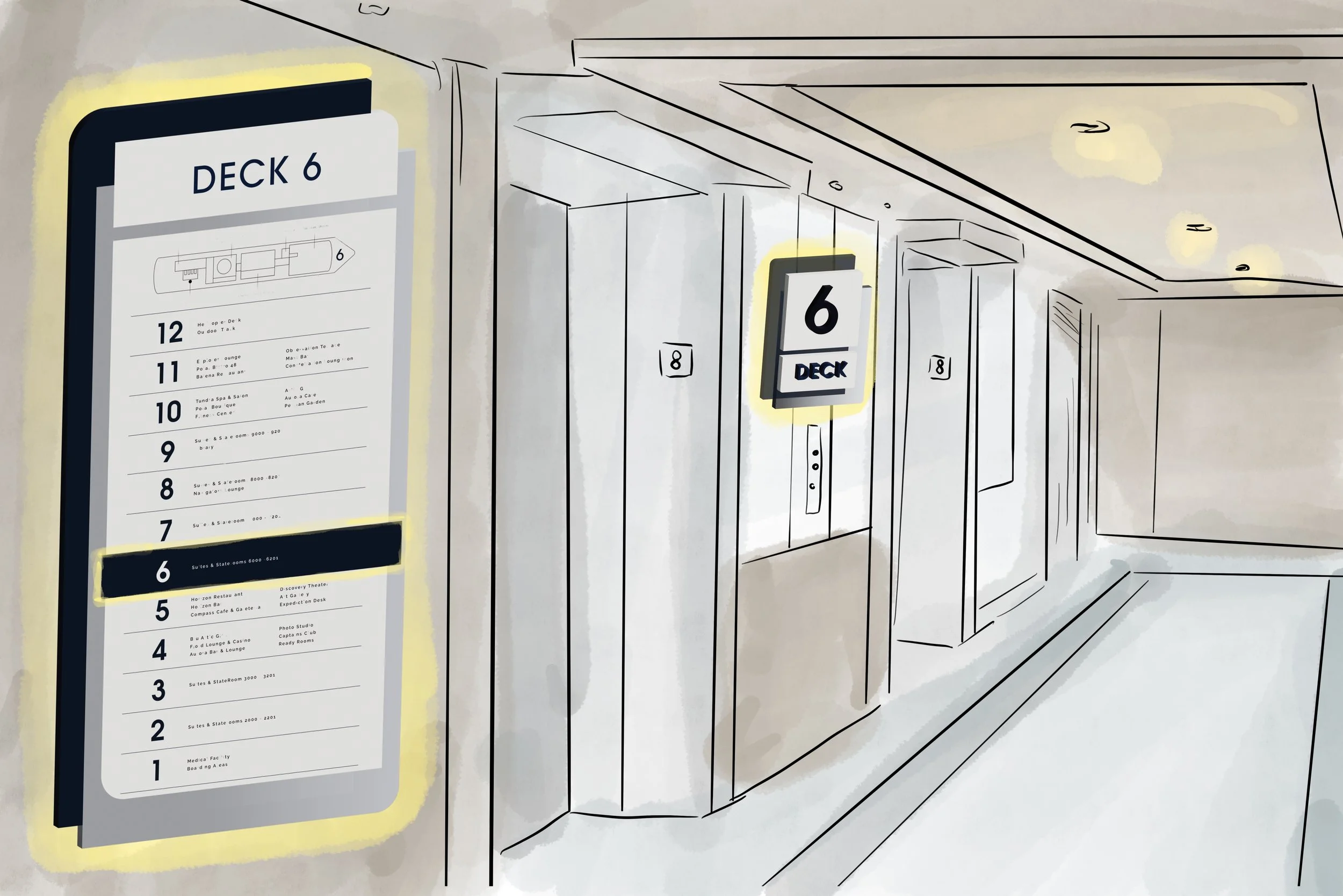
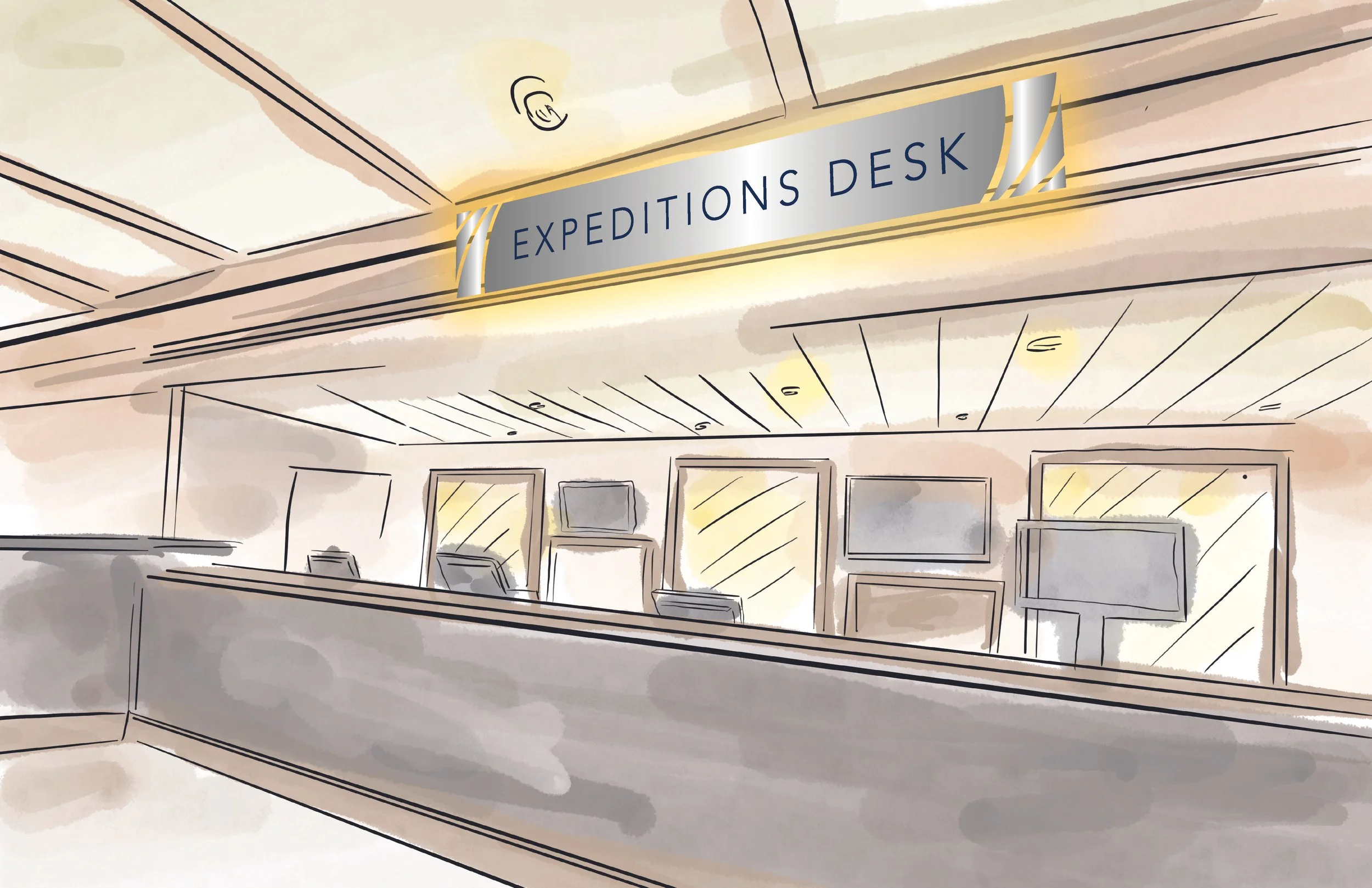
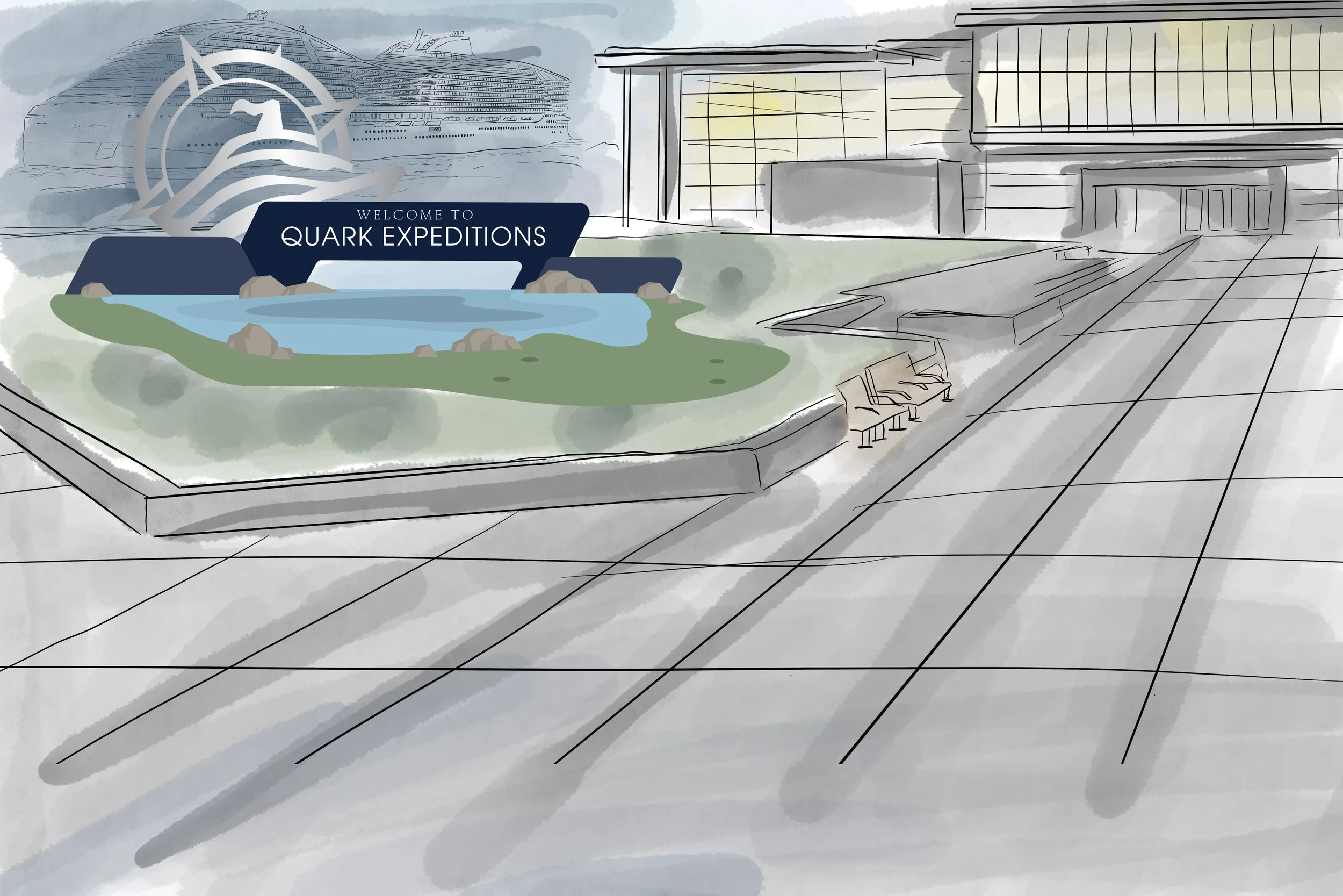
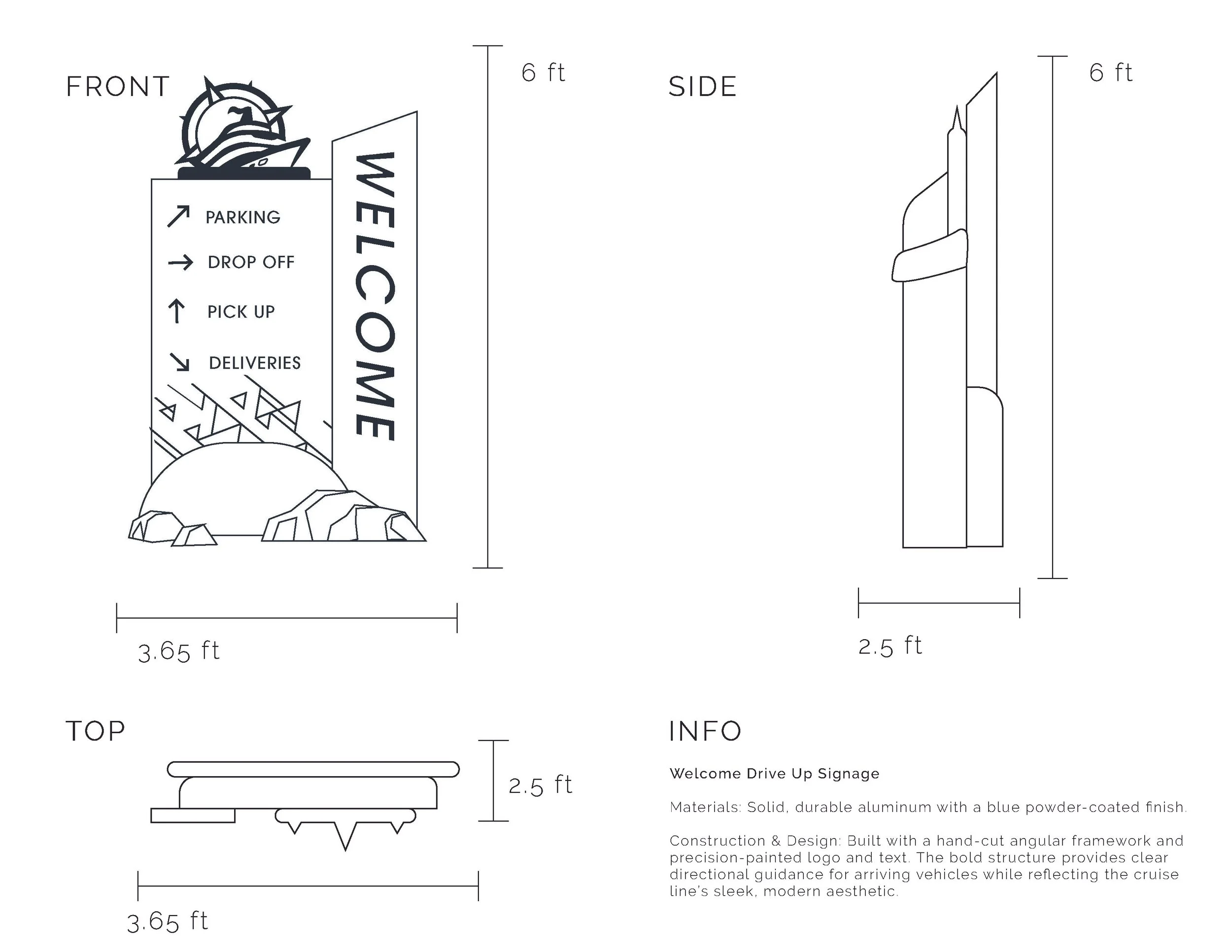
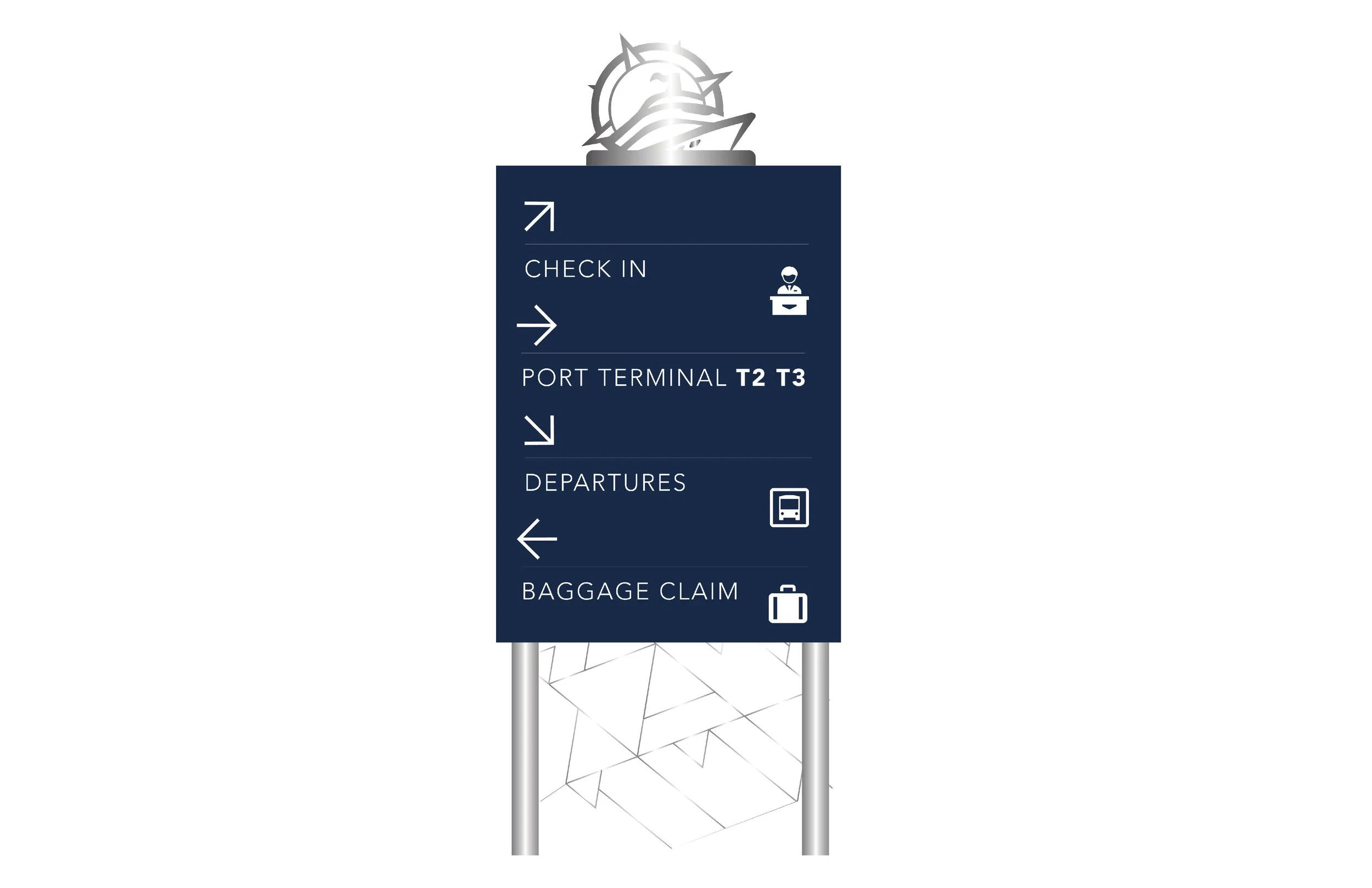
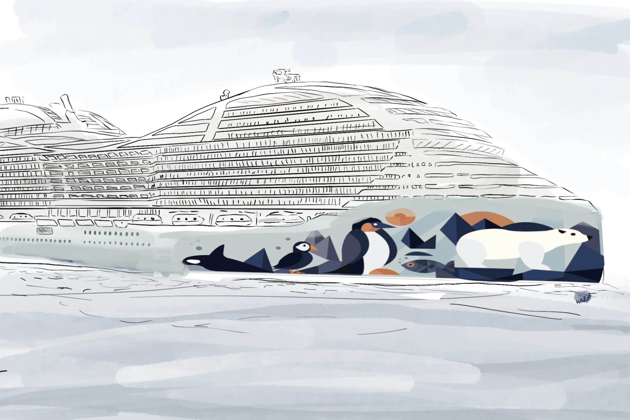
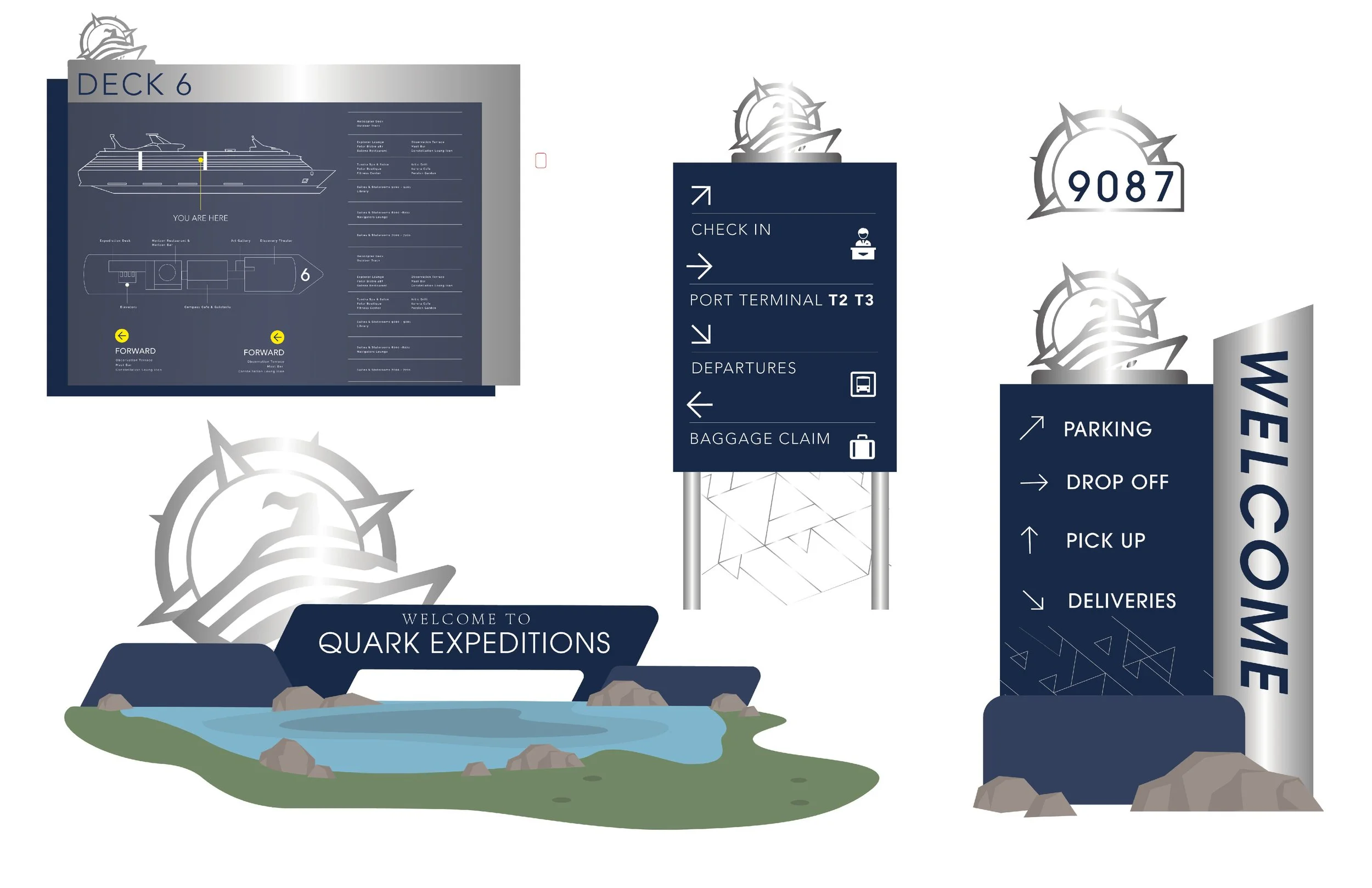
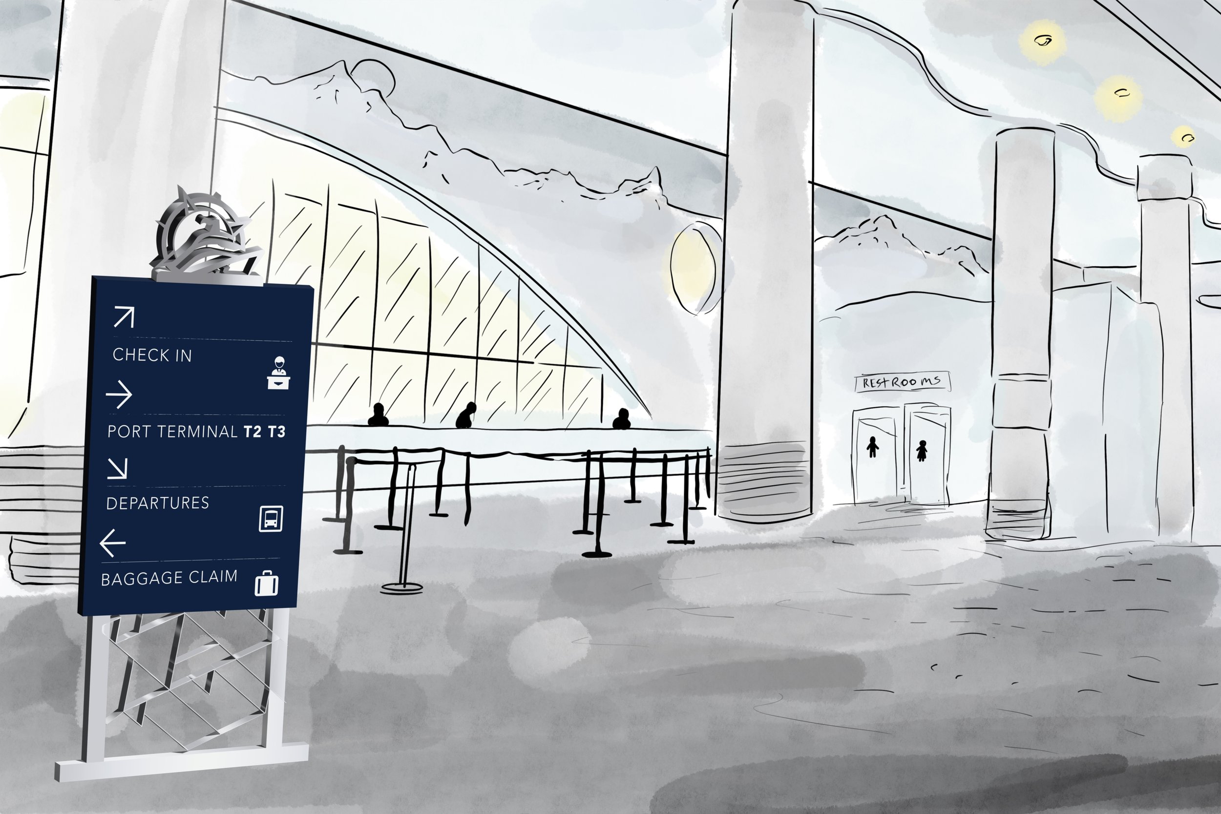
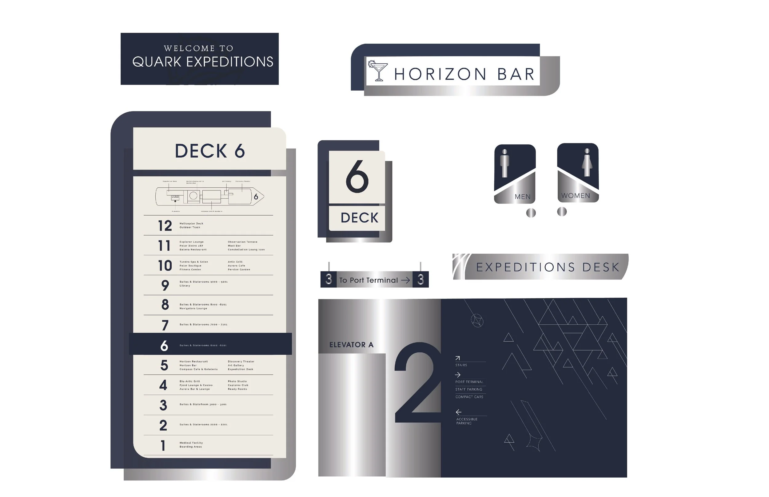
The Quark Expeditions rebrand reimagines the cruise experience through a refined visual brand system inspired by the Arctic environment. The identity shifts to cool blues and grays to better reflect the landscape while simplifying the logo into a clean, modern mark. The project focuses on environmental design, creating a cohesive way finding system that guides passengers from check-in through boarding and into onboard spaces. The system extends across signage, key cards, wristbands, mobile app interfaces, and onboard essentials, ensuring a consistent and immersive brand experience at every touchpoint. Hand-drawn renderings were used to visualize spatial applications and bring the environment to life, resulting in a design system that enhances navigation while strengthening the overall sense of place.


PROCESSES
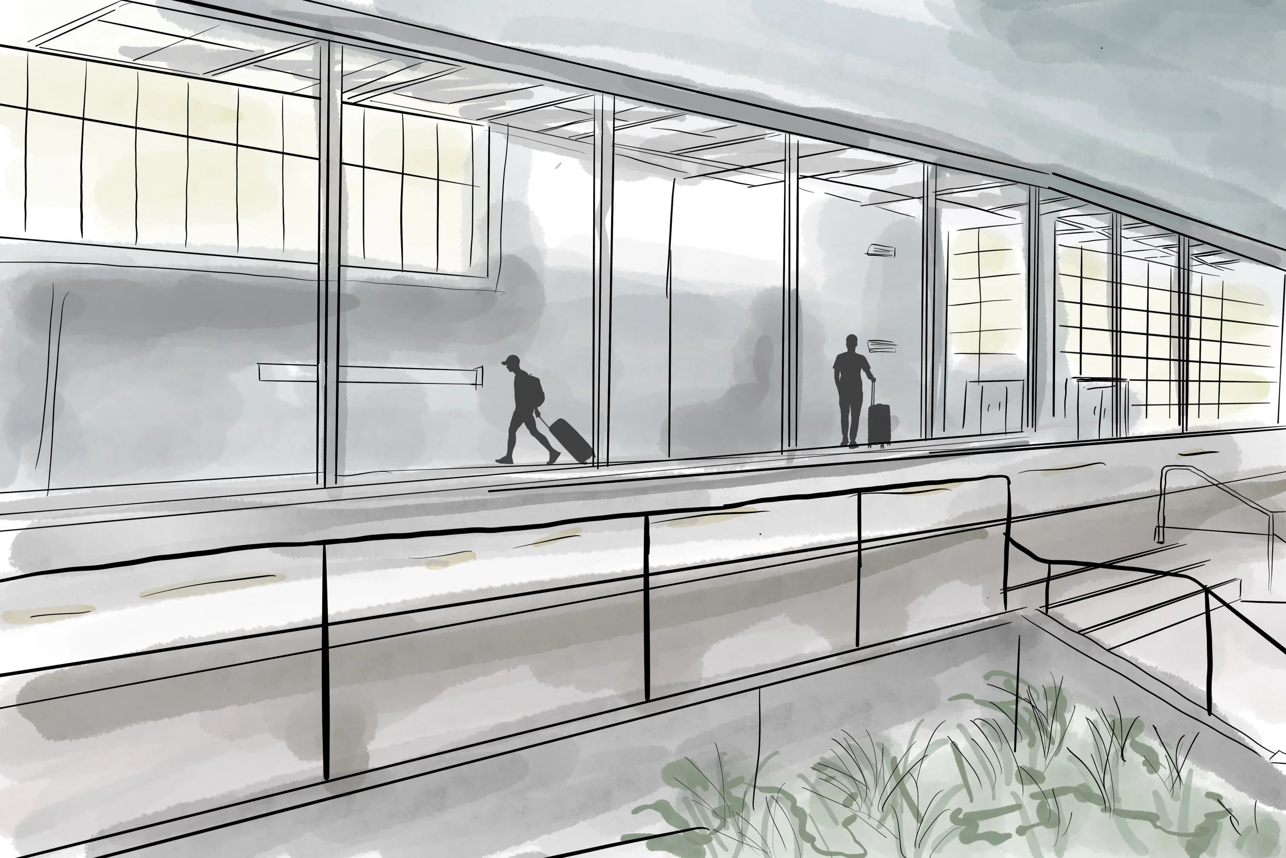
Started with moodboarding and logo research, then logo & matching sign sketches and type exploration. Hand-drawn illustrated renders for final signage display.